Masters project · London College of Communication · 2014
Dual cultural identity of second-generation British Indians
Using graphic design as a research tool to understand what it means to grow up both British and Indian, and then building a brand where that duality is something to celebrate.
- Programme
- MA Graphic Branding & Identity, UAL
- Audience
- British Indians aged 16 to 24
- Methods
- Participant observation, focus groups, interviews, questionnaires
- Outputs
- Identity, guidelines, cards, magazine, web app
Background
During my London days I worked part-time as a waitress at Gujarati weddings. Serving halwa puri, shrikhand and asli ghee mein doobi hui puran poli at these big fat weddings, I watched the heavily dressed aunties, the authentic dadimas, the suited-booted uncles, and the slightly confused young “half desis”. It was entertaining to hear them pronounce the names of Indian dishes in what sounded to me like a very British accent.
The rituals were exactly the same, but the anglicised pandits preferred complete silence during the chants, as if that was what weddings expected. I don't remember a single wedding back home without plenty of masti at high decibels. These weddings were clearly shaped by British mores. Every bride had her bridesmaids, dressed in classy saris with all the Indian trappings.
A (con)fusion of identities
Over time, this participant observation turned into curiosity about people who looked like me and yet were different in some way. For my Masters at the London College of Communication, I set out to understand this fusion and confusion among young British citizens born to Indian families. I wanted to know what it's like to live with a double identity, and how graphic design might support them.
I always wanted to use graphic design as a tool to investigate the social and cultural lives of people.
Free from a commercial client, I wanted to see how design's processes, methods and techniques could address a social concern. The course ran like a mini PhD. I expected the internet to be full of research and design work on this identity question; it wasn't. Very few artists had explored dual identity, and the Singh Twins and the Beard project stood out among them.
Alongside participant observation I ran focus groups, one-to-one interviews and questionnaires with young people, parents and organisations. For a year, and especially through the summer festival season, I visited Maharashtra Mandal, Hounslow Mitra Mandal for Ganesh Utsav, the Swaminarayan Trust, ISKCON and others. Indians in Britain tend to gather by language (Gujarati, Marathi) or geography (South Indian associations, the Manchester Indian club). I never found a pan-Indian organisation that represented every shade of Indian.
What I saw
These groups were built by an earlier generation as a place for grown-ups to create community life away from their Indian homes. Young people, whose home was right there in Britain, barely took part.
The young British Indians I met shuffle their double identities. Family and peer pressure pull them both ways, as do dress codes, etiquette and rituals like marriage. Some were well integrated with British norms. Others felt torn between the culture of their homes and the society around them. Many behaved one way at home and another with friends, partners and colleagues.
The research also sharpened the audience. Indians can be indistinguishable from other South Asians in appearance and language, and they share many challenges. But India's rise as an economic power, and its seat in the G20, had changed how this group saw itself. They felt more British Indian than British South Asian.
Target audience
Young people aged 16 to 24, born and raised in the UK, with India-born parents from any state or community.
Their elders are at peace with their Indian identity. It's the young who confront cultural identity every day, both inside and out.
Defining duality
They want to be British and Indian at the same time. In a multidimensional city like London, British Indians could be a distinctive group that draws on the best of both worlds. A community of their own could anchor that hybrid identity in a way older Indian associations can't.
Not a return to some mythical Indian identity, but a brand built on the lived experience of being British Indian.
Here, “Indian identity” means its most public faces: Bollywood, the Taj Mahal, the Himalayas, the many languages, food and dress, classical music, dance and yoga. It also means the image of a young country with a fast-growing, IT-led economy. The community could create real and virtual platforms to celebrate, build relationships, express feelings and show what they make. That called for a visual identity, which is where graphic design came in.
Brand ideation
I created _ING: a community where young British Indians can celebrate their cultural duality as a strength. Nobody has to follow the diktats of any one group here, and everyone can feel at home where the two cultures meet.
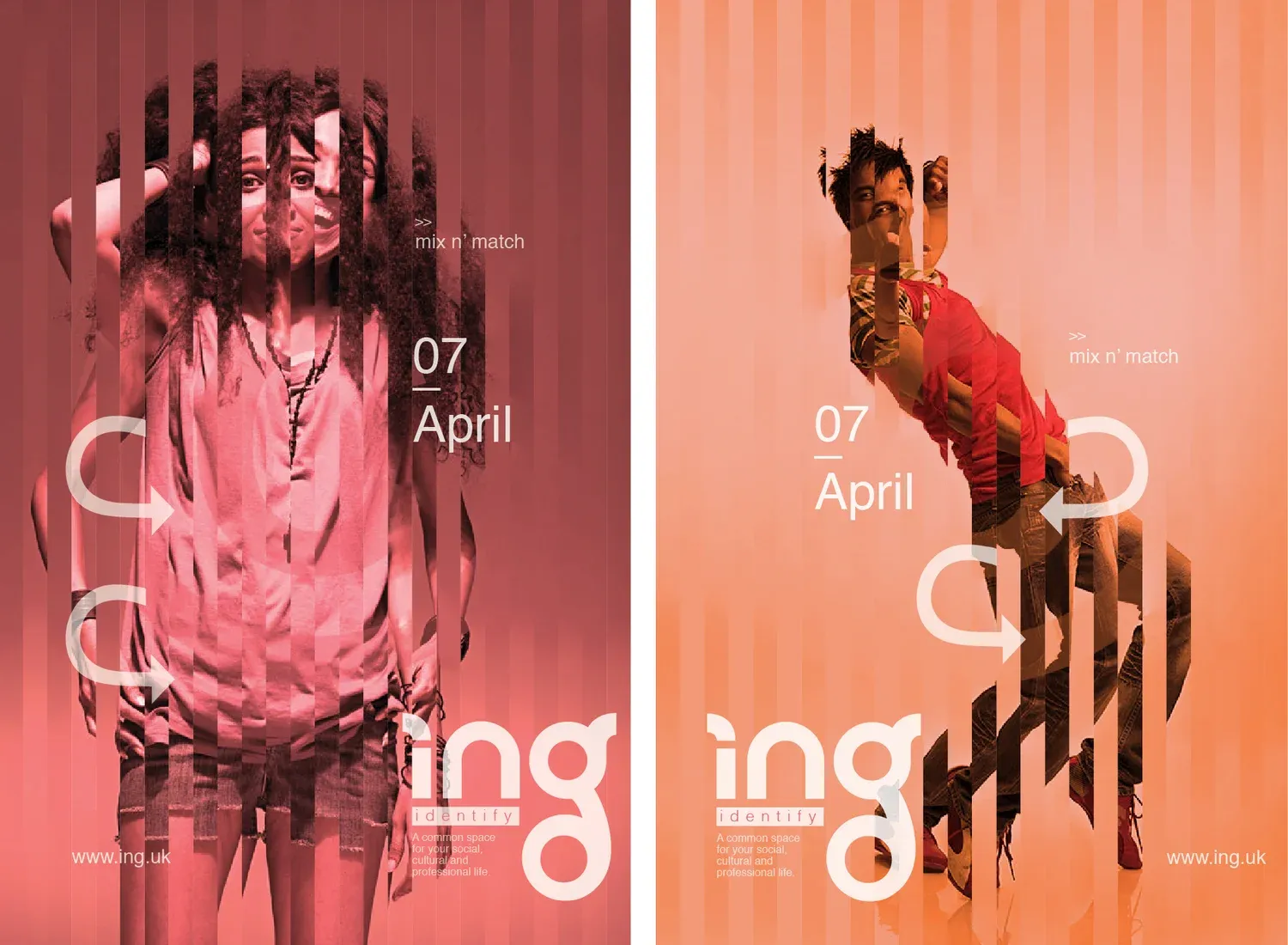
I was inspired by the Singh Twins' fusion art, Hermann Rodrigues' Kilt meets Kirpan, Gavin Fernandez's Victorian Indian Monarchs of the East End, and brands like Duke of Delhi. Because real bonding happens face to face, I went beyond a website to print and merchandise that communicate, remind and re-enact the group's identity.
The name
It had to be youthful, English, with an Indian flavour. I tried fusing English words of Indian origin with English ones, like Desi George, Curry Mantra, Duke & Maharani, West British Company. None felt like a community. Then it came to me: ING, India and England merged into one word. In grammar, -ing is the present continuous: a state of evolution, dynamism and fluidity. The underscore, borrowed from internet handles, makes it an adjunct to the British Indian persona.
The logotype
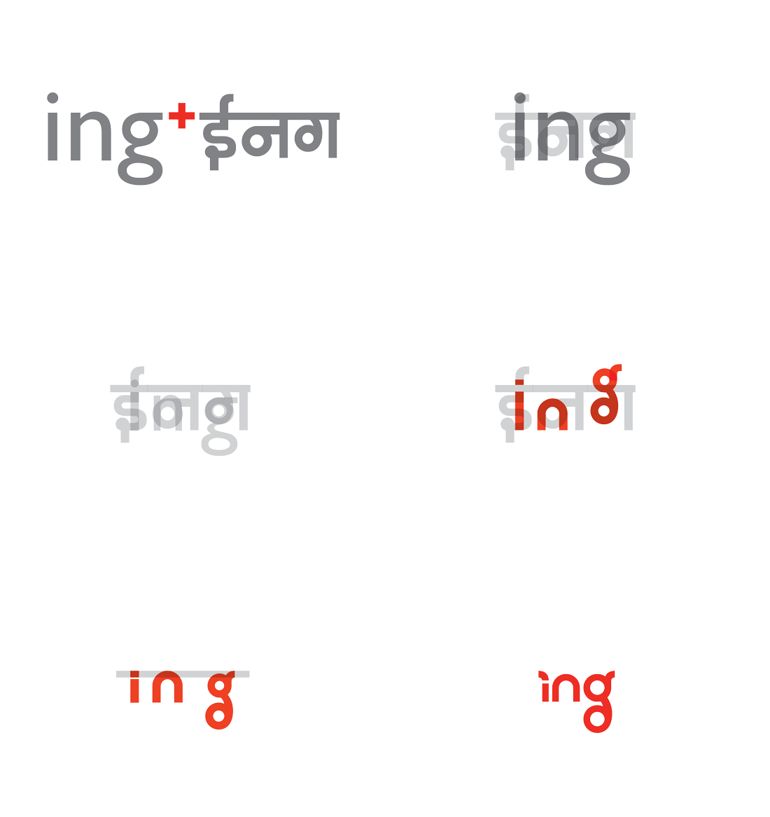
I wanted a Hinglish typeface, so I studied Devanagari and Roman scripts for shared forms, and built the letters on a circular grid. Circles suggest unity, completeness and transformation, which is everything the brand stands for.
Colour and brand language
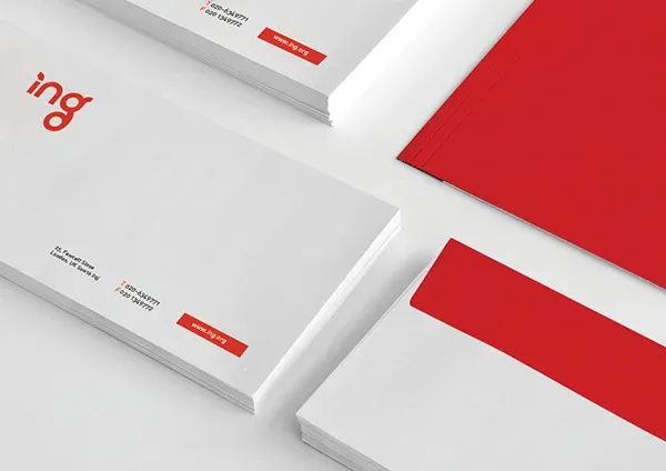
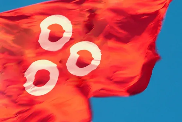
One colour, for easy mass printing: red, which in Britain signals prominence and authority. That felt right for a community that wants to stand out and be counted. The brand language is built from red rings. The guidelines invite members to make their own patterns, as long as they use two or more same-size rings or parts of rings. That way the community literally creates its identity together.
What I made
Brand identity
A Hinglish logotype built on a circular grid.
Brand language
Red rings the community can remix into new patterns.
Brand guidelines
Rules loose enough to invite co-creation.
Deck of cards
A playing deck that doubles as conversation starters.
Magaz_ing
A two-way print magazine for British Indian voices.
_ing Social
A social and dating web app, somewhere between Facebook and Shaadi.com.
The deck
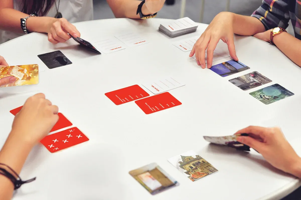
A playing deck that is also a set of conversation starters, so people can bond over games and talk. The fronts reimagine spades, hearts, diamonds and clubs in the ring language. The backs show British and Indian life: home, travel, family and culture. Some cards carry only words; a few are left blank for players to write their own topics.
Magaz_ing
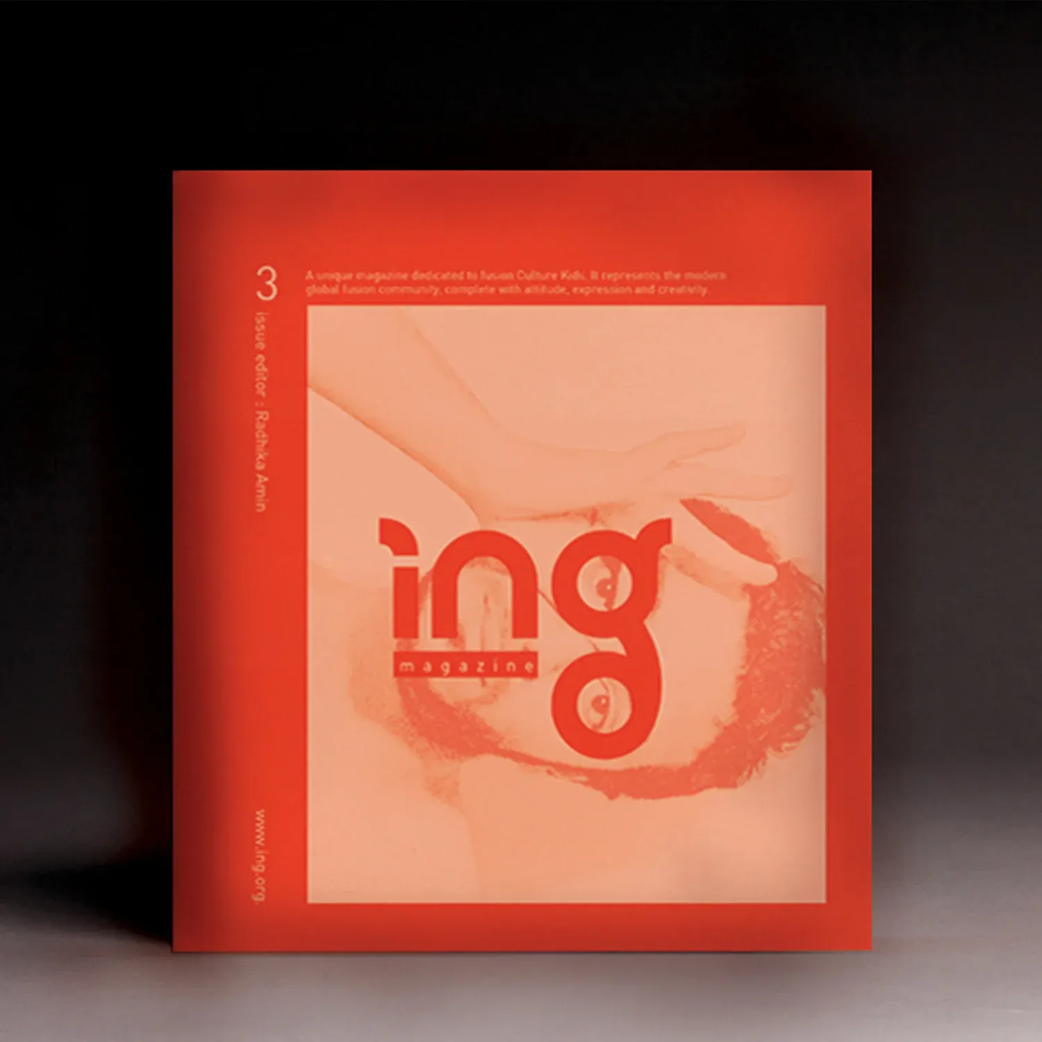
A print magazine for today's British Indians, a platform for their perspectives and creativity: art, interviews and work on how people depict their identity. It opens from both sides, with the organisation's brochure one way, collected blogs and writing the other. This issue features an interview with UK artist Hiten Patel and a review of a film about identity. The back cover holds small insert cards for festivals and events.
_ing Social
A social and dating web app, inspired by Facebook and Shaadi.com. Members create profiles, upload photos or connect Instagram, and sign up with Facebook. The shyer ones can create a fresh account instead. The interface stays deliberately simple.
A work in progress
This project taught me that a brand is much more than a letterhead, a visiting card and a printed T-shirt. There is still a need for more interfaces between the British Indian community and wider Britain, and for more activities and symbols that express both identities. I want to help build a pan-Indian identity that sits comfortably with British roots.
For me, _ING is still a work in progress.