Work / Simpl
The rebrand that failed
- Role
- Director, Head of Design, 2023
- Team
- Brand and product design, with leadership
- Methods
- Leadership workshops, brand audit, positioning routes
- Outputs
- Brand identity, guidelines, website, product language
This one ends with a no. It taught me more about leadership than most projects that worked.
My time at Simpl
As Head of Design, I led 22 designers across the app, Checkout, merchant tools, brand, website and social. I built the practices and design system that made it feel like one company.
Conversion efficiency, 99.6%+ order success at 0.5M orders a month
Adoption across 600+ merchants
Lift in organic customers from referrals
Followers, plus campaigns and the website
Mentored merchants, built sales pitches
So product and brand felt like one company
A company doing a U-turn
Most people knew Simpl as a pay-later app. In reality it had many features, each telling a slightly different story.
One tap, no card, no OTP.
Safe on every order.
Buy now, pay later, cardless.
Every subscription in one place.
Three equal parts, merchant paid upfront.
One bill across many merchants.
Six features, six different stories.
Merchants across India
Trusted users
Series B, Dec 2021
Checkout
Pay later
- Credit features for shoppers: Pay Later and Split in 3
- Lived inside the Simpl app
- Success meant more people paying later
Checkout
- A checkout network for merchants and shoppers
- Lived inside other brands' stores
- Success meant more sales for D2C brands
Checkout was the future, but the brand hadn’t caught up. No visual language, no mission, and sales, app and website each said something different. I reworked the information architecture and started a brand refresh with the website.
So I wrote the brief nobody asked for
Simpl needed a fresh start, not a new logo. We called it Simpl 2.0, and started with words:
Vision: to connect businesses and buyers, effortlessly.
Mission: enabling every transaction with ease, trust and security.
Who we wanted to be
First we looked at fintech around us. Jupiter leaned on space and a mascot, PhonePe and Paytm had the default look, Slice was loud and young, and CRED’s NEOPOP was hard to adapt. Simpl sits inside other brands’ stores, so it couldn’t shout. It had to be distinctive and still fit in anywhere.
I ran a workshop with founders, sales, product and marketing to agree one brand vision. Agreeing the words was half the battle.
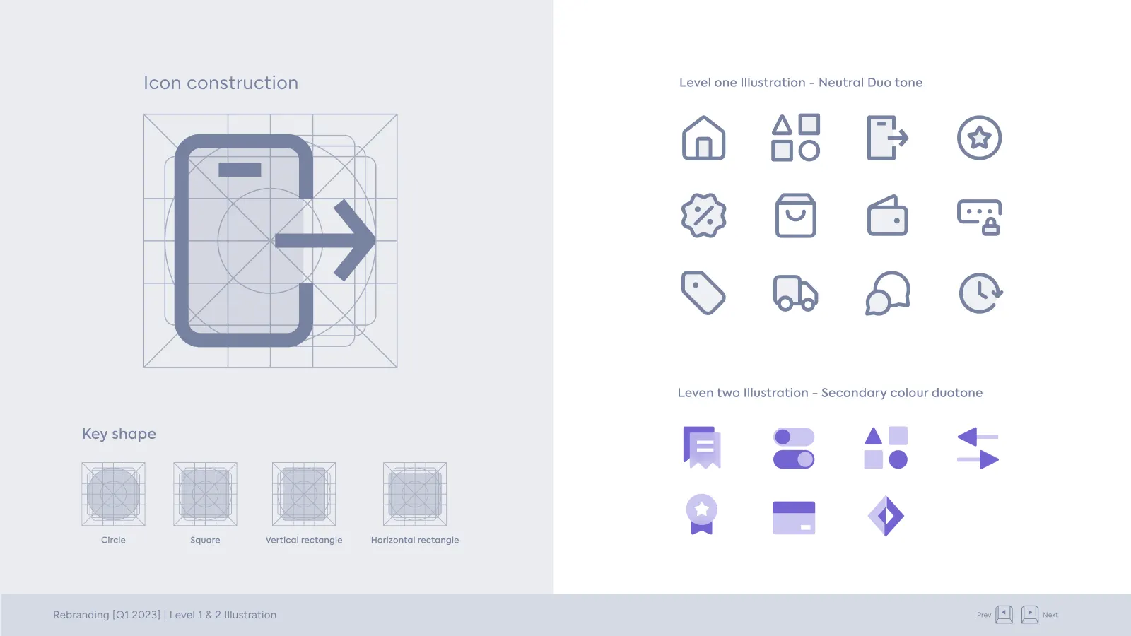
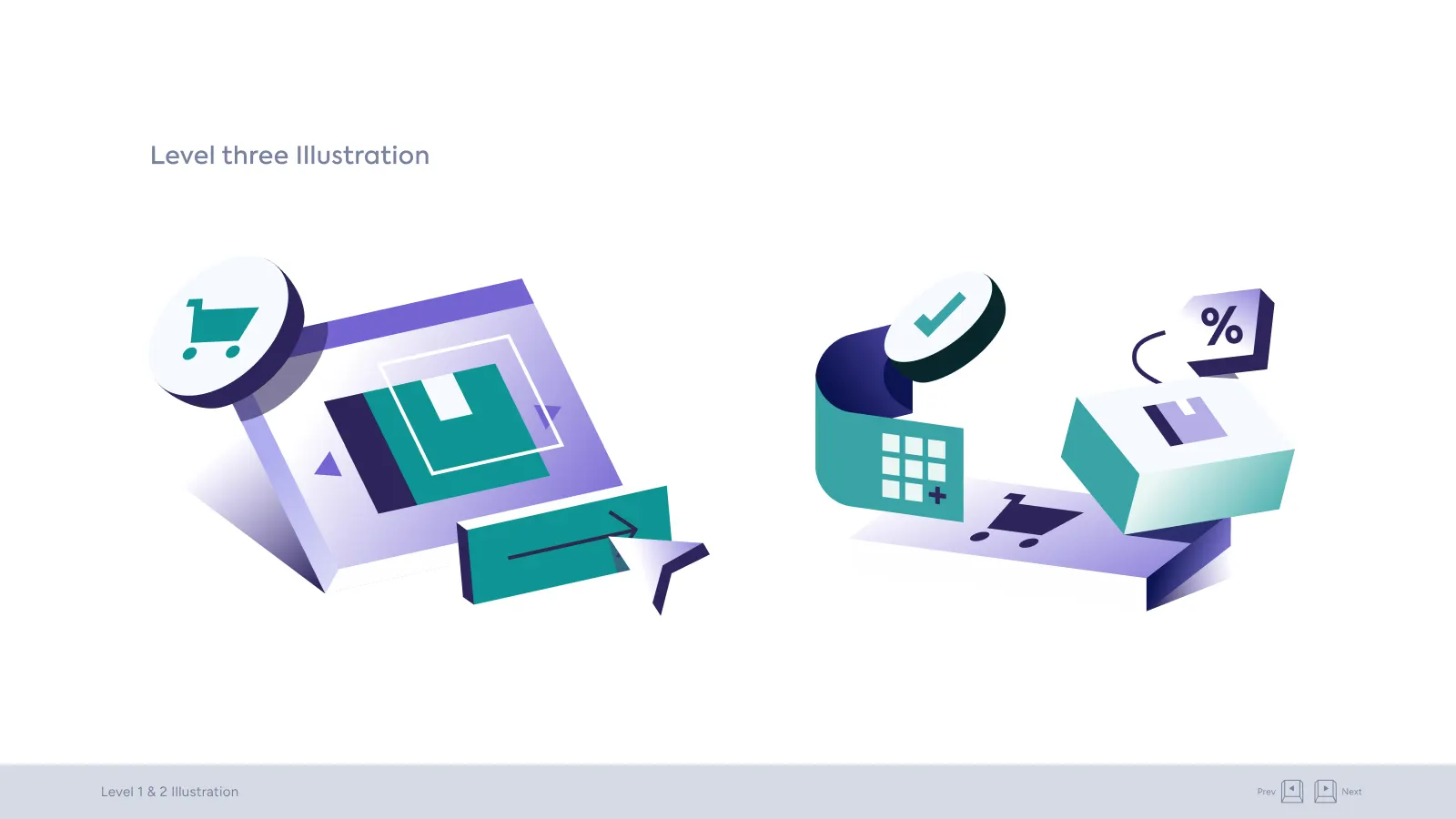
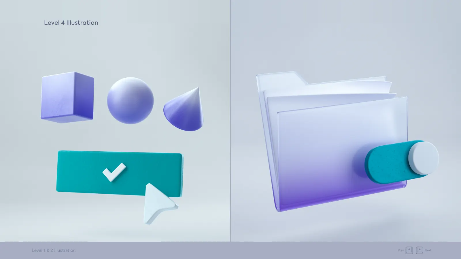
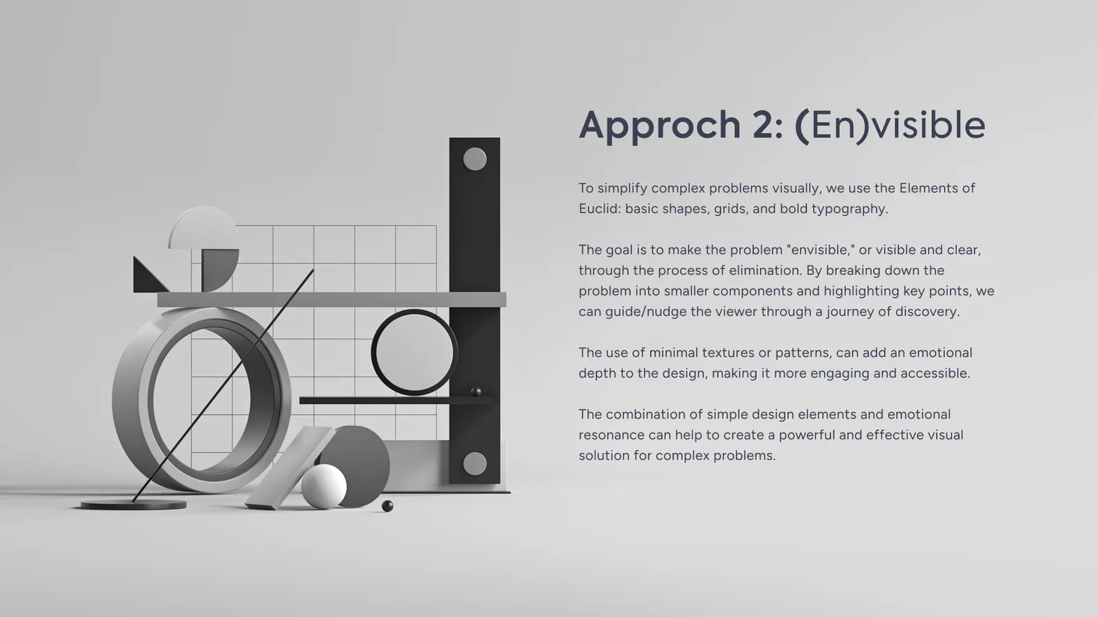
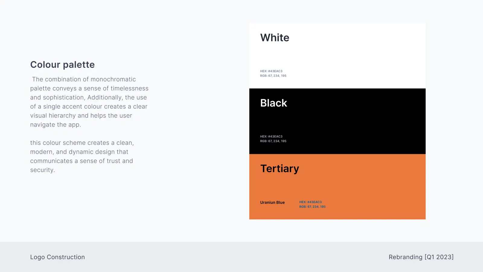
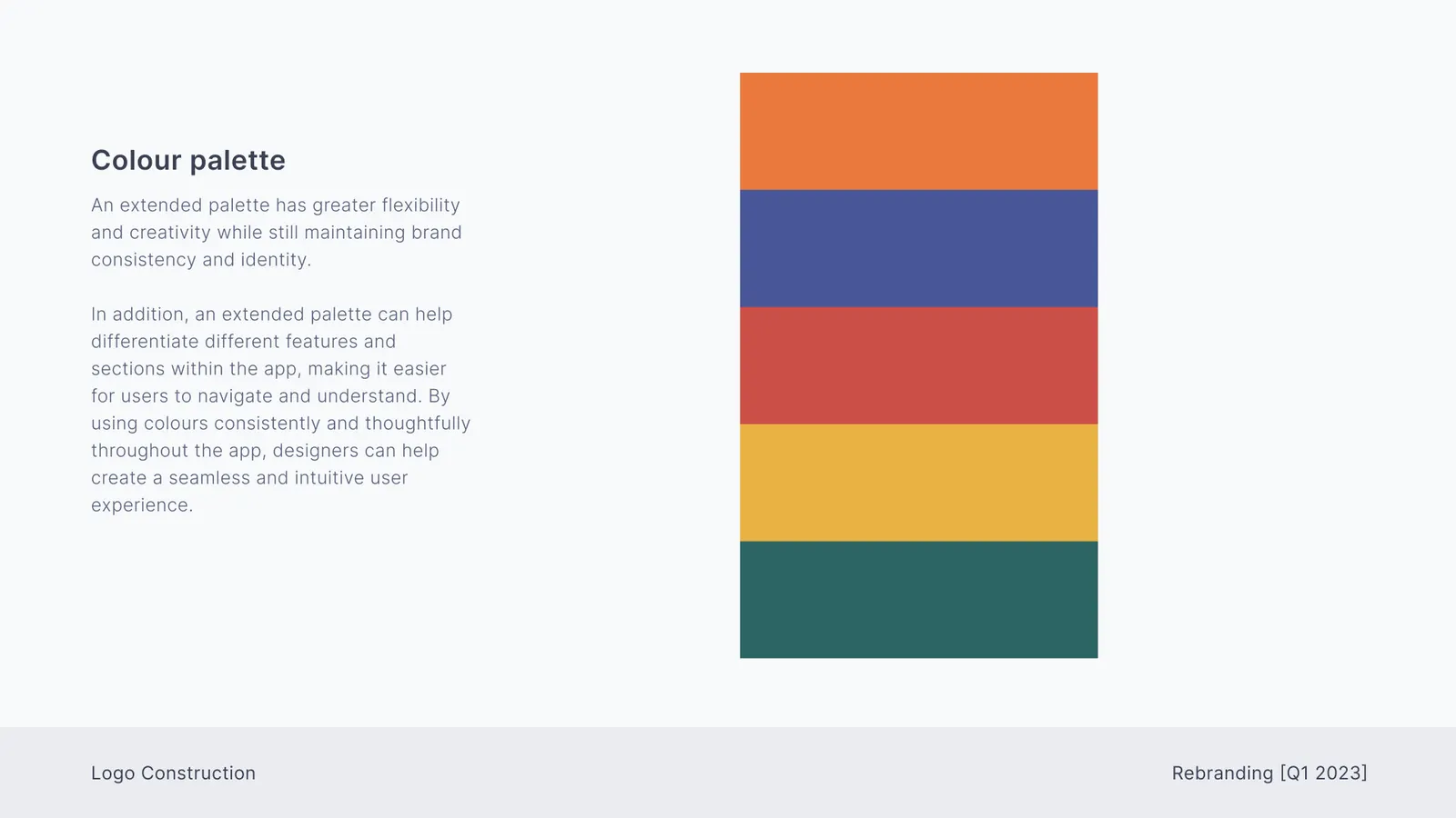
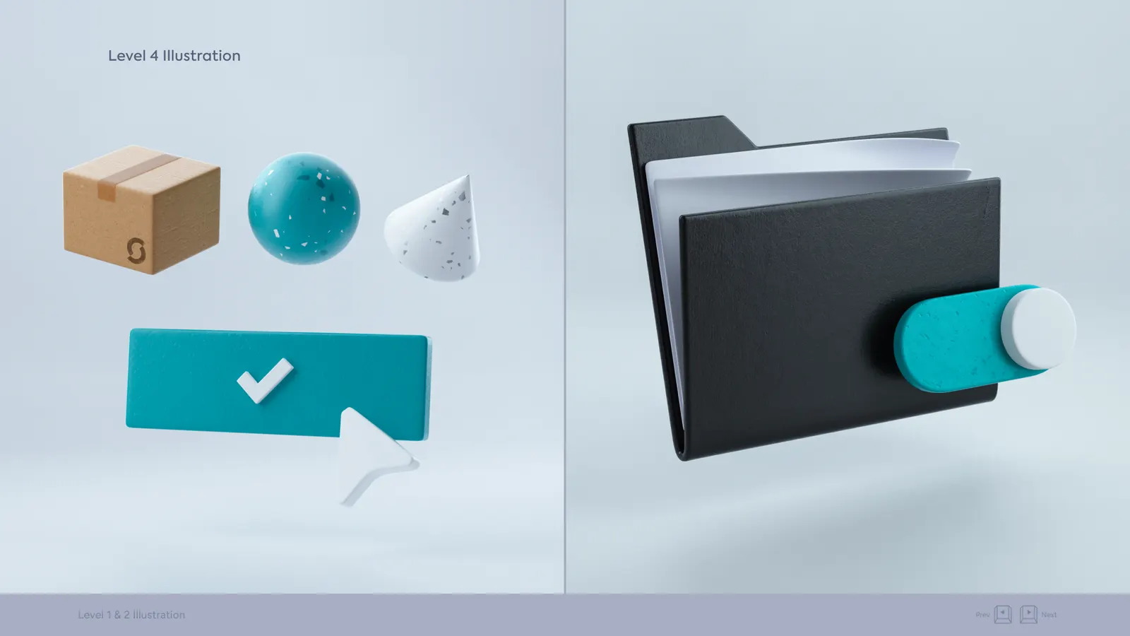
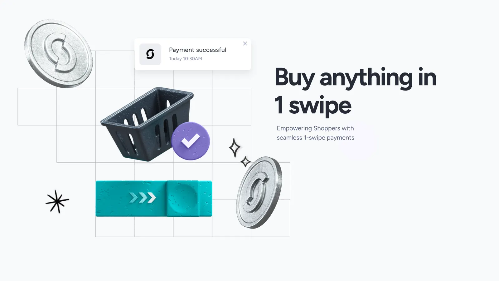
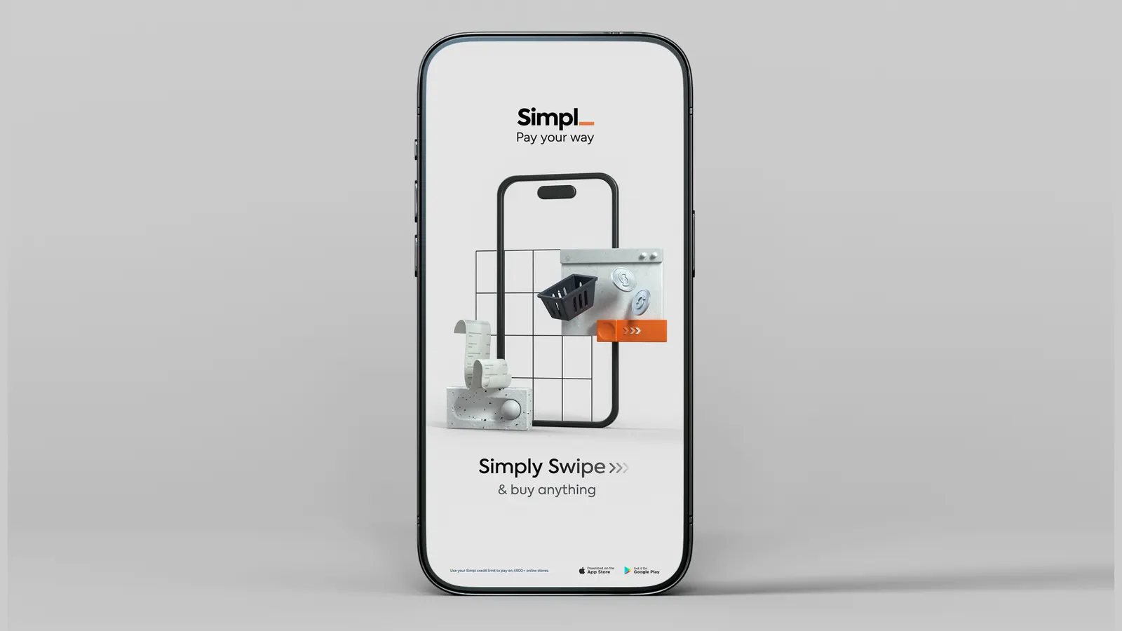
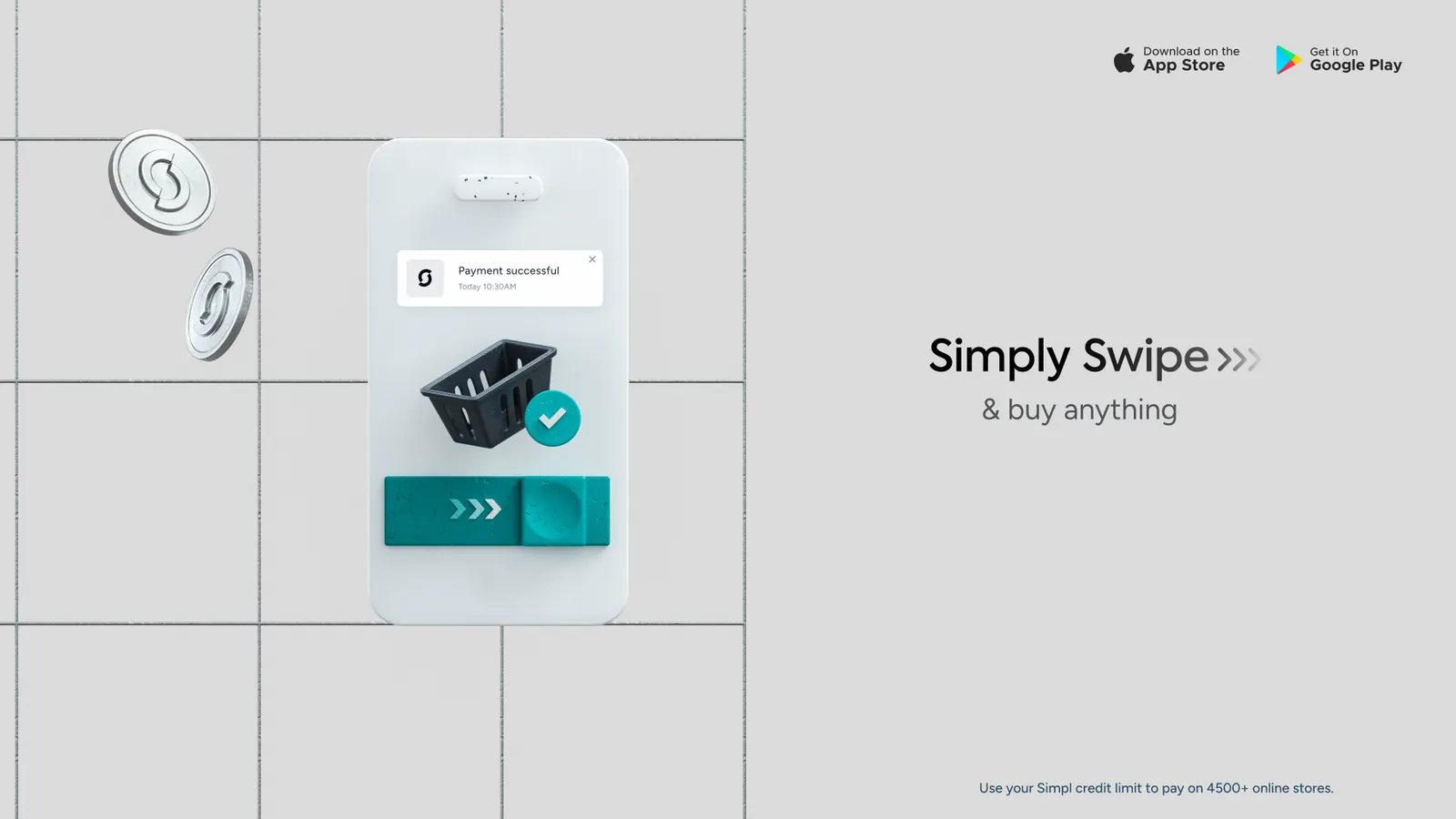
The look: monochrome, minimal 3D and hand-drawn line art. At its heart was the Design Key, Euclid-inspired grids and bold type.
Two routes
From there, the team built two complete concepts.
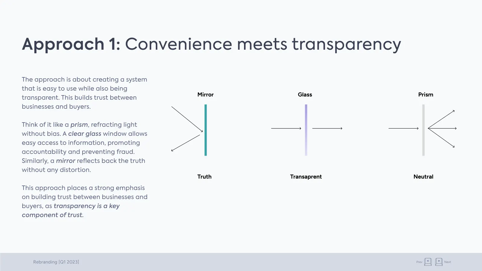
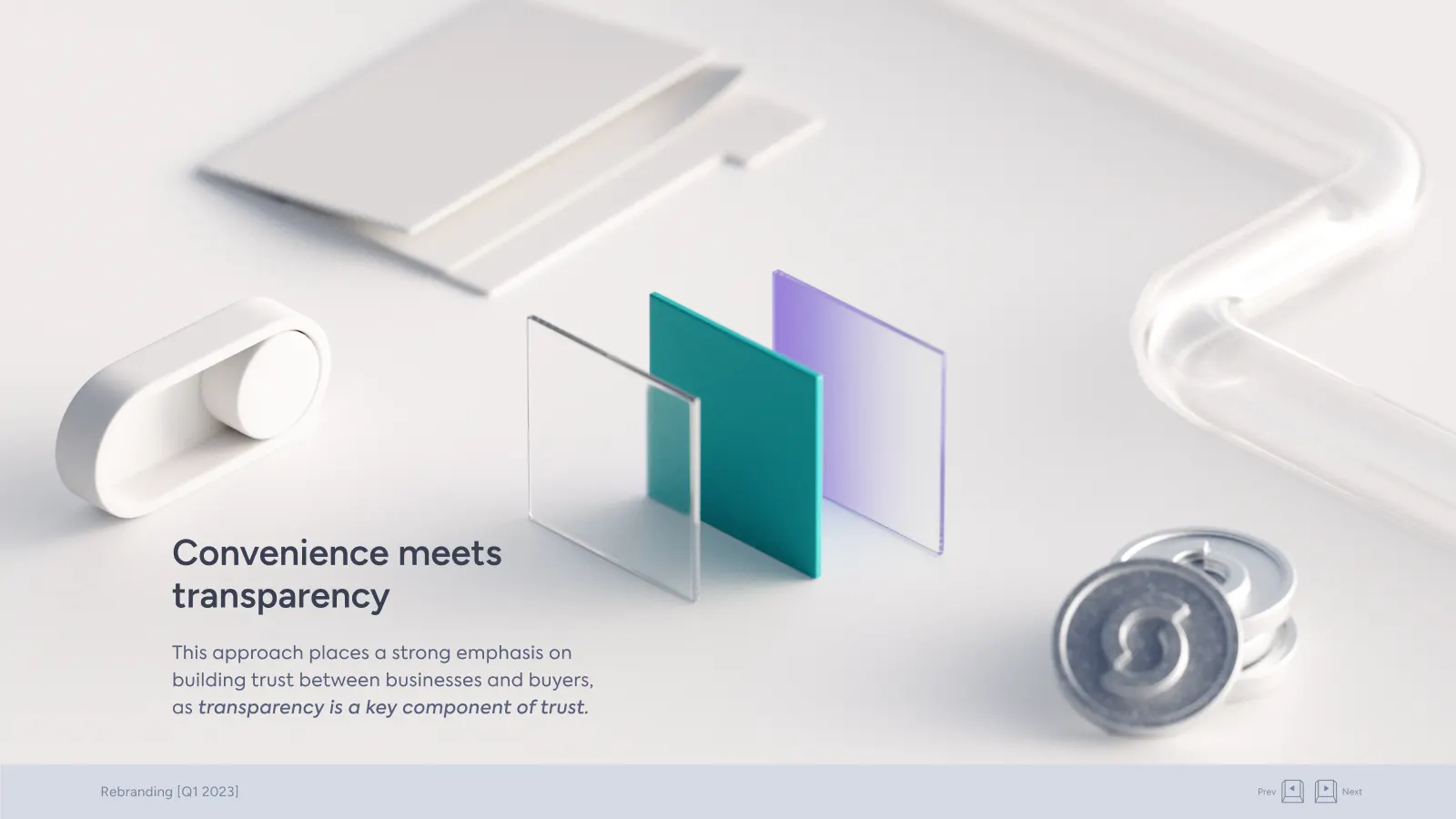
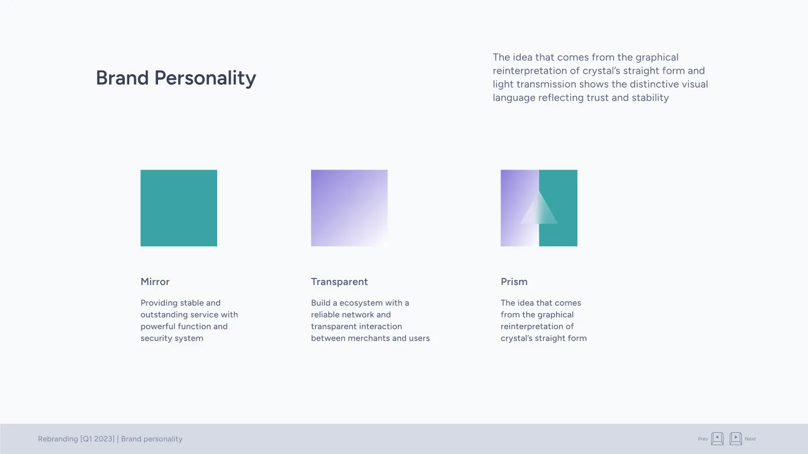
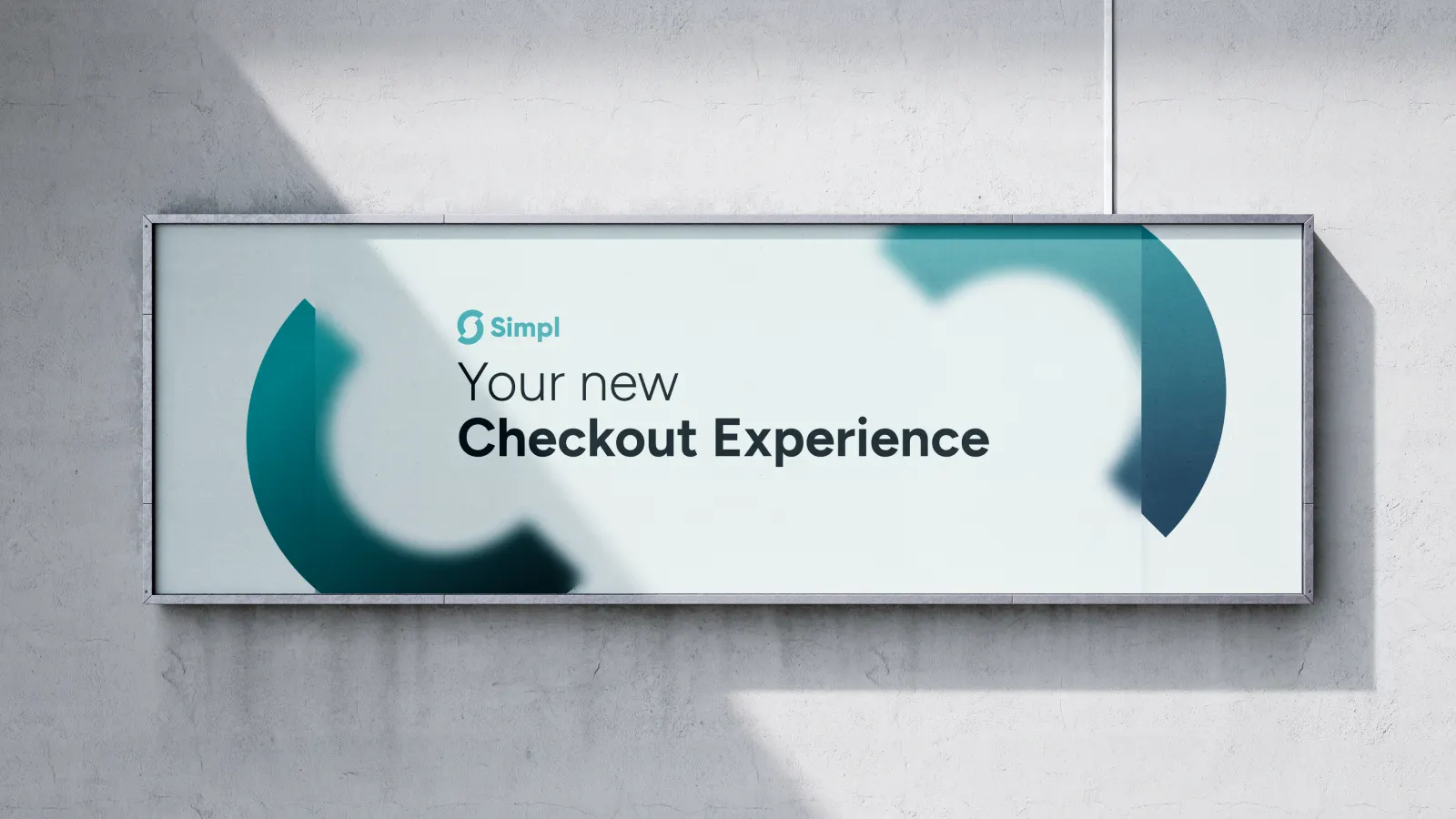
Convenience meets transparency
A brand that makes checkout feel easy and honest at the same time.
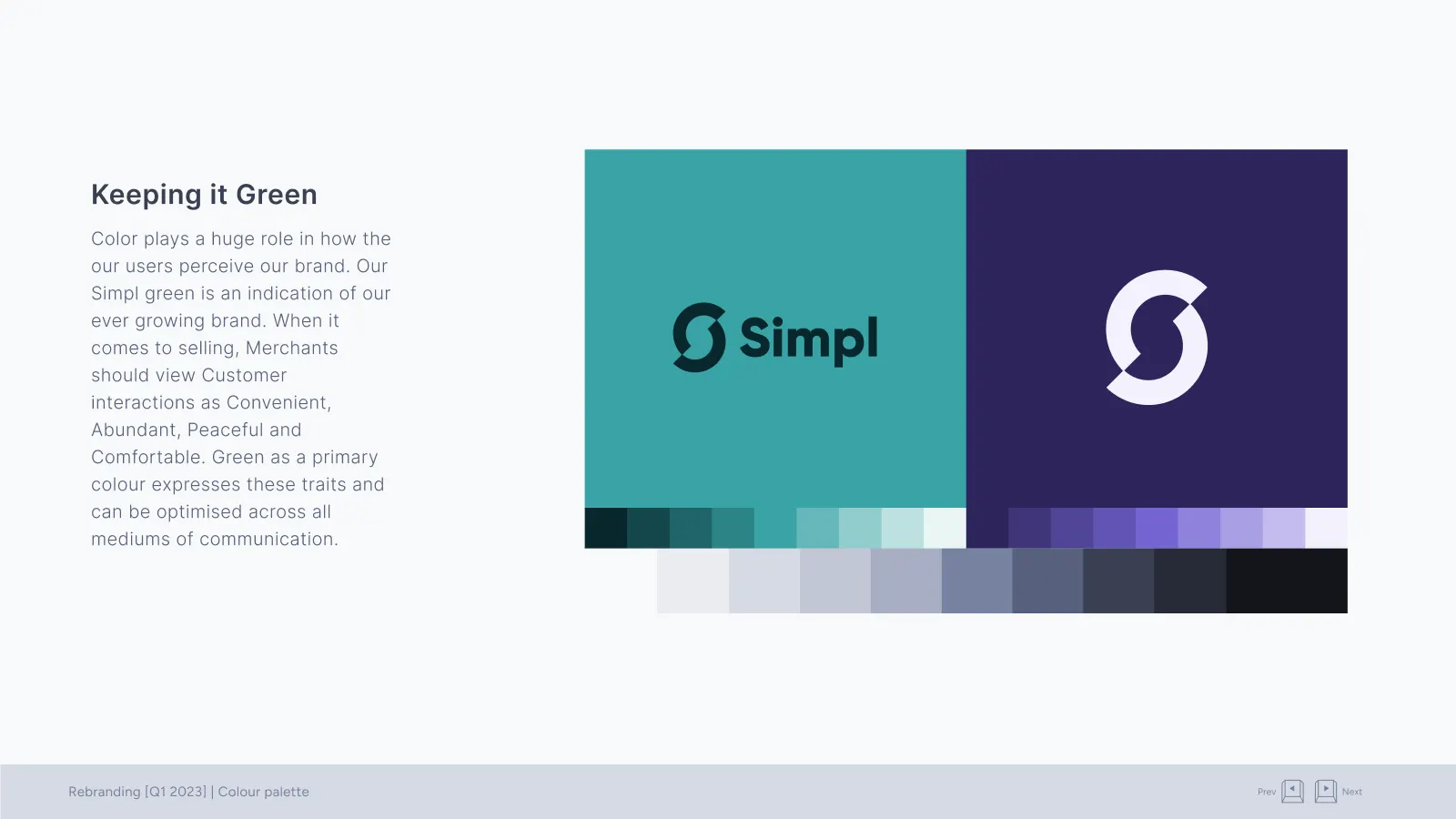
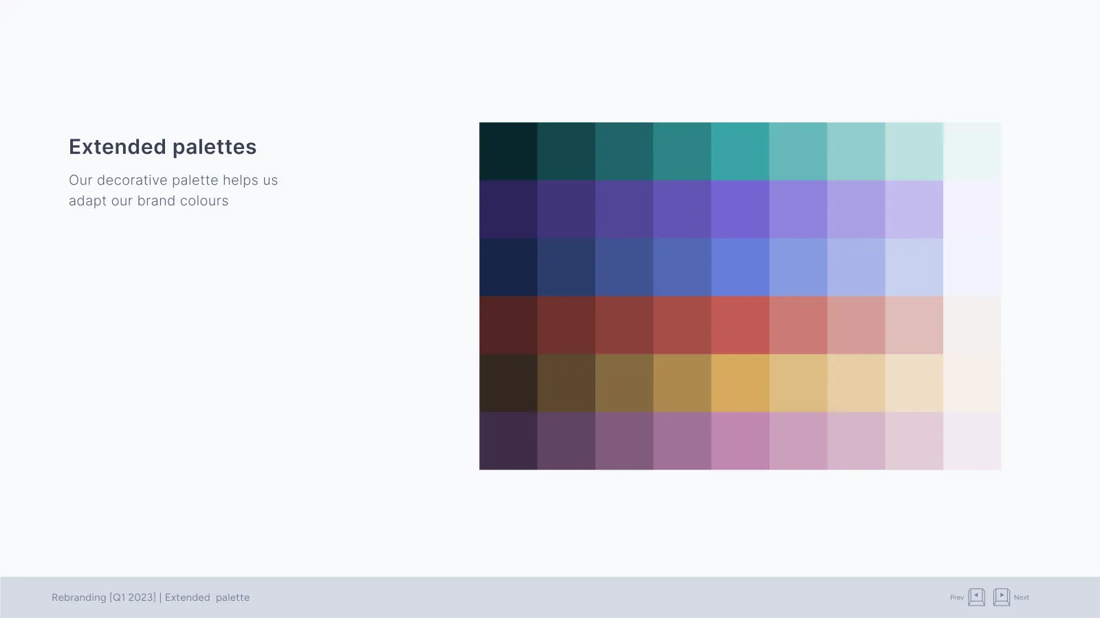
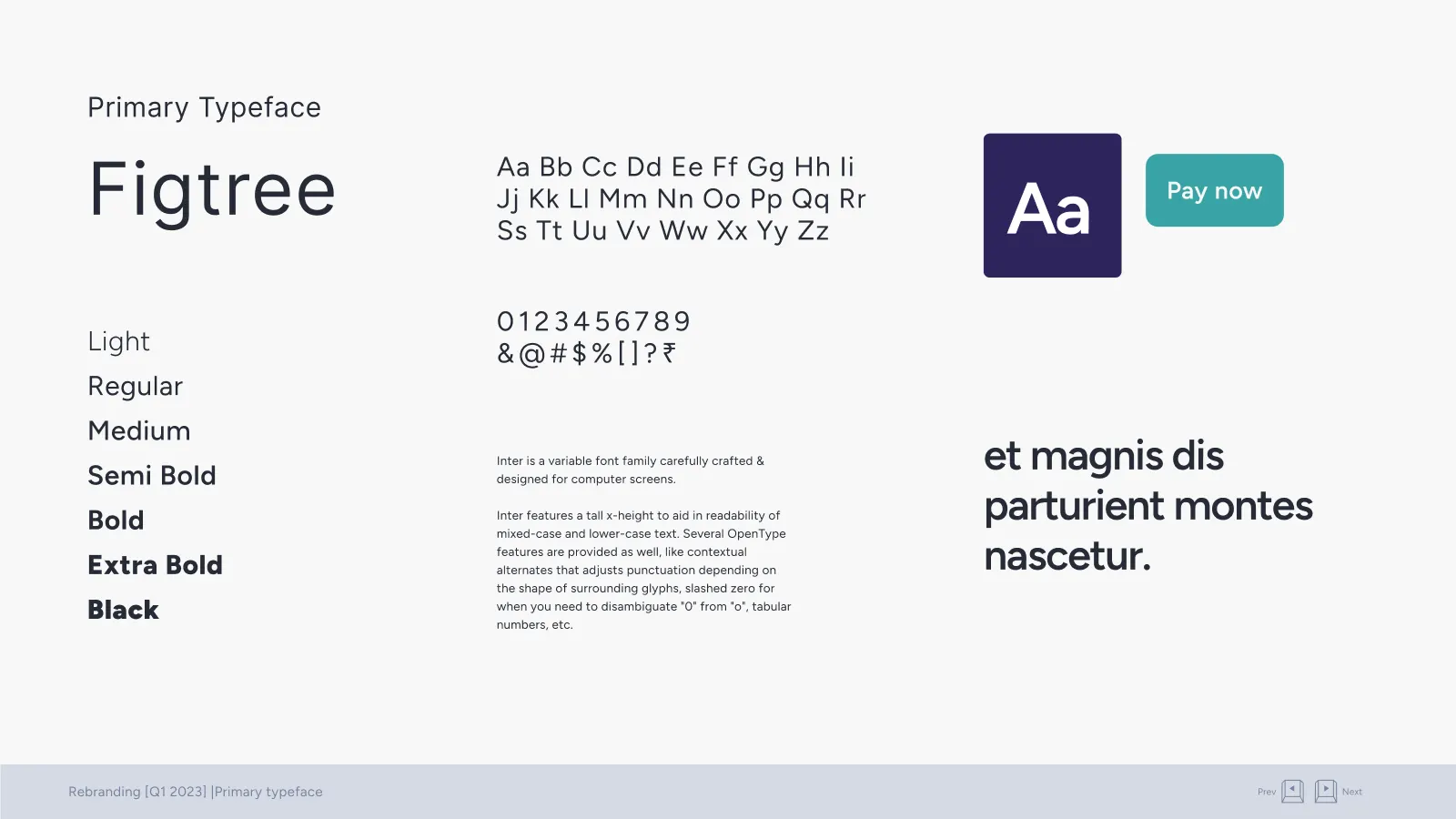
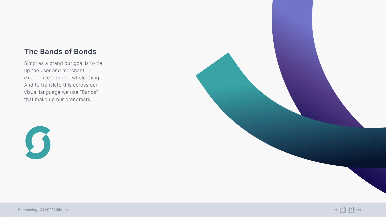
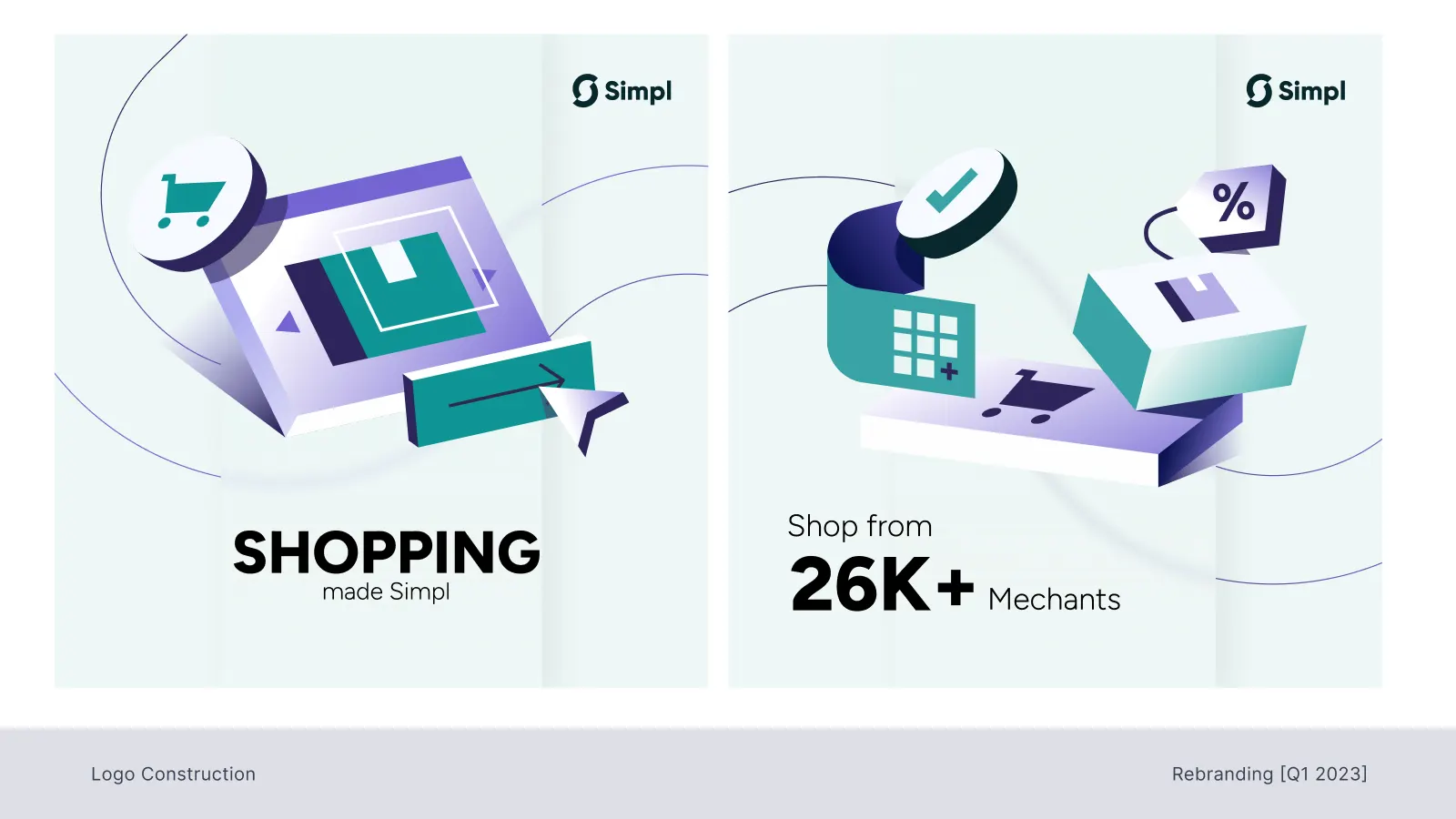
(En)visible
Simpl as the quiet backbone behind every store, stripping things down to the essentials.
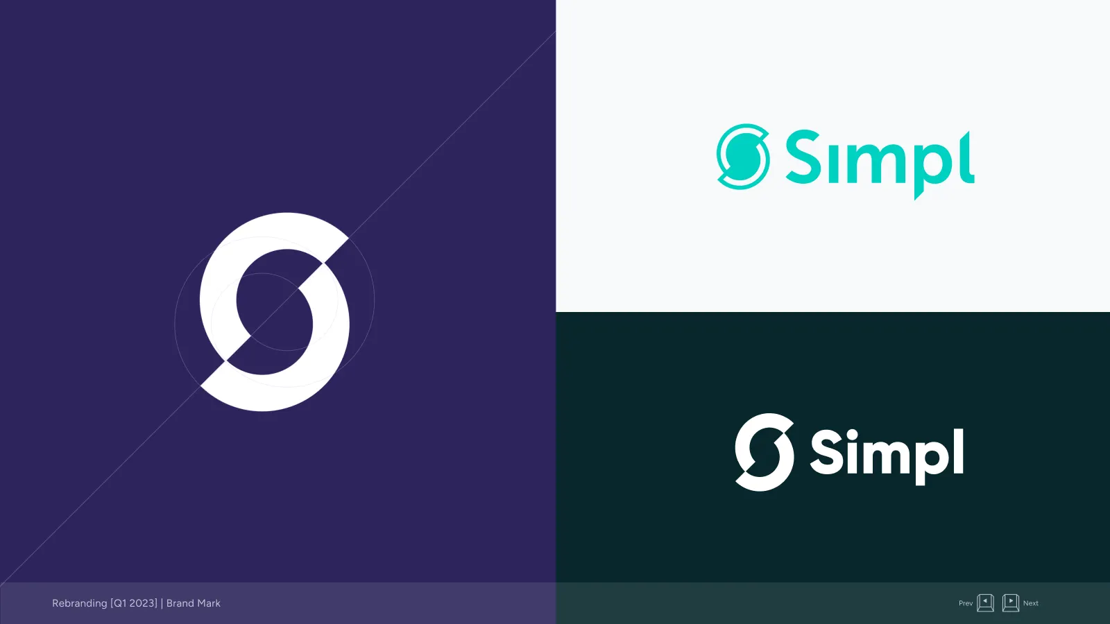
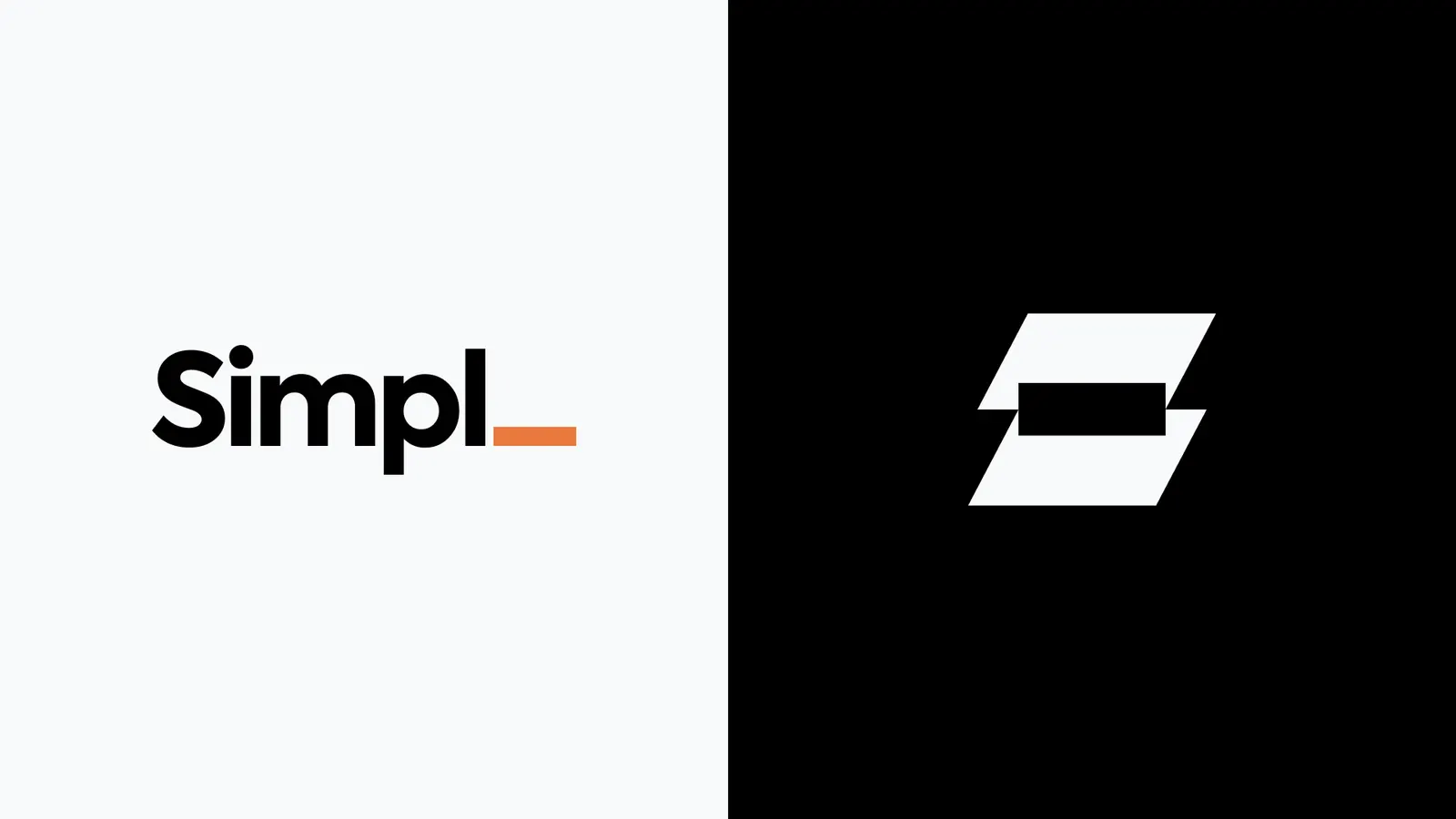
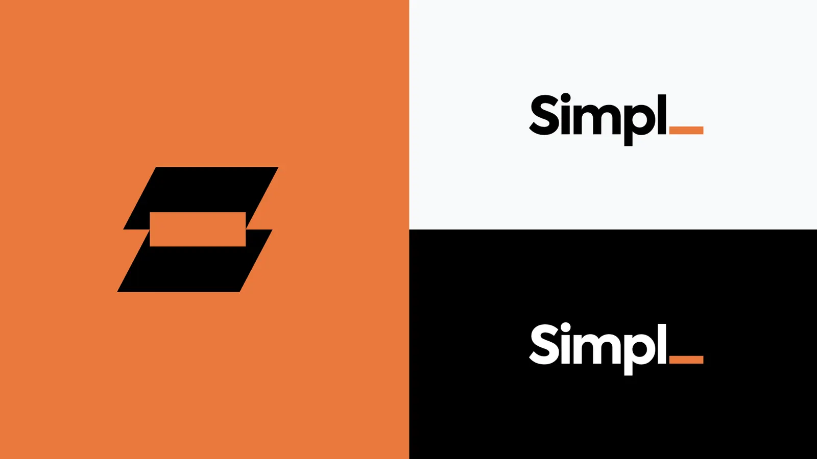
Simpl is “simple” without the e, and our founder said the best experience is no experience. So the missing e became a dash in the logo, and Simpl became a minimal canvas for partner brands.
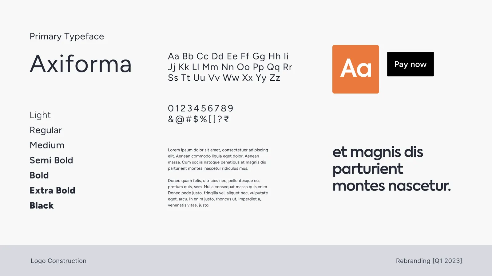
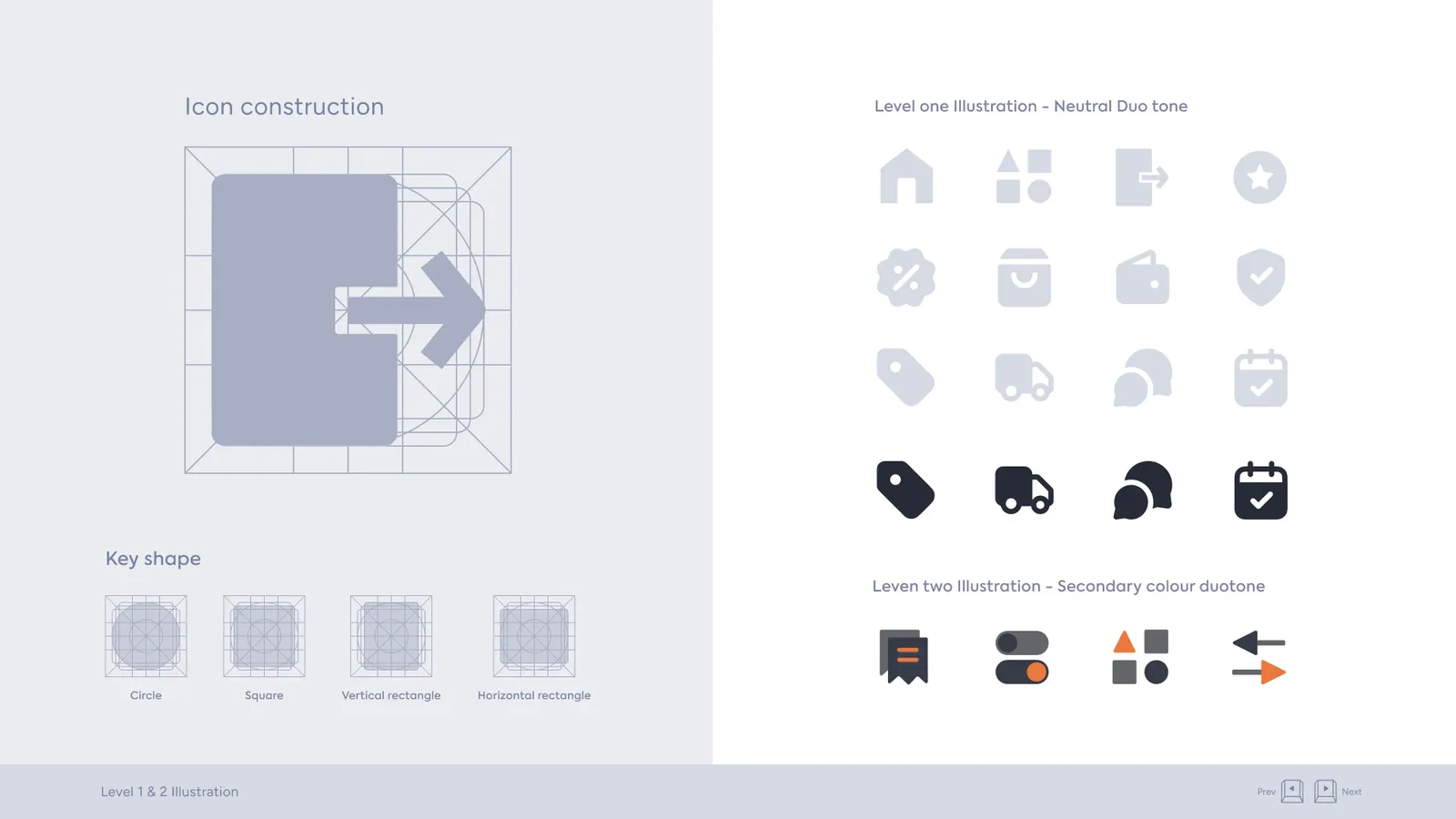
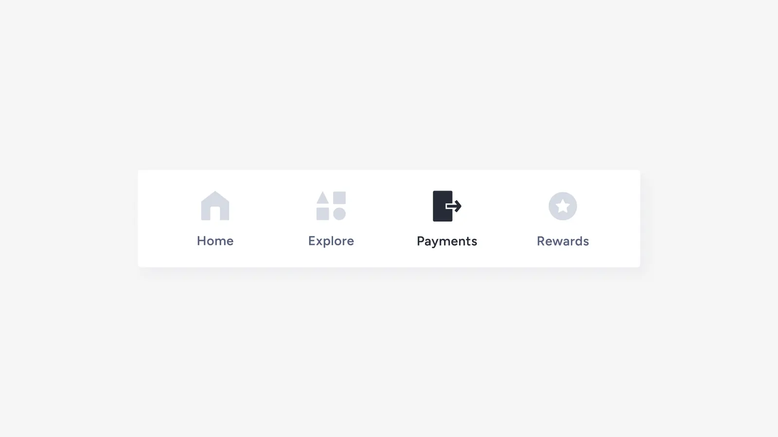
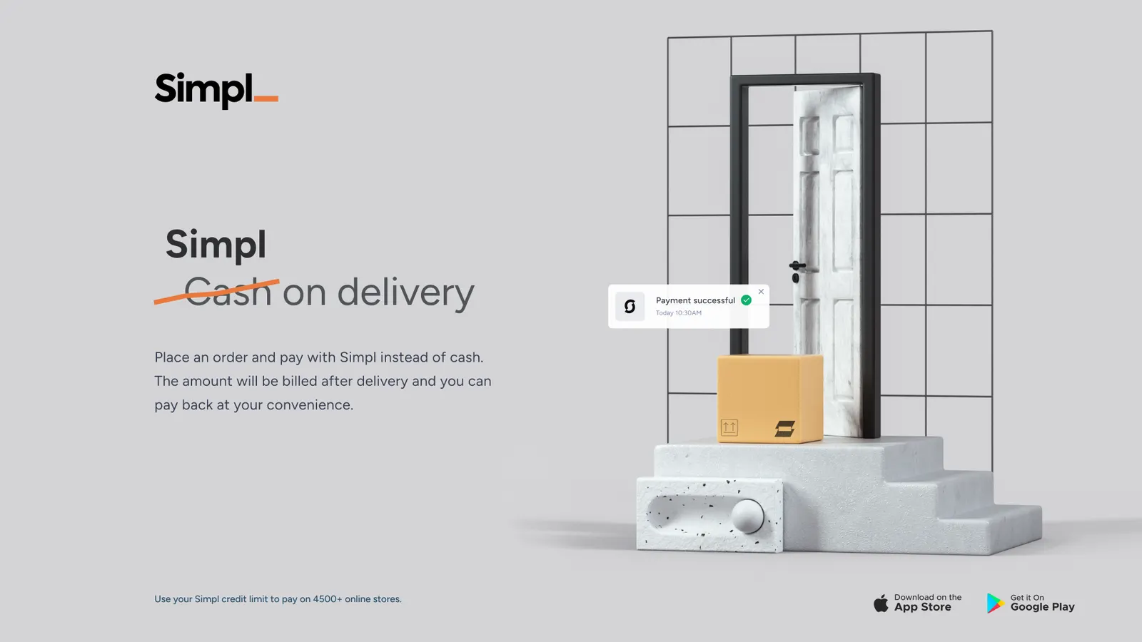
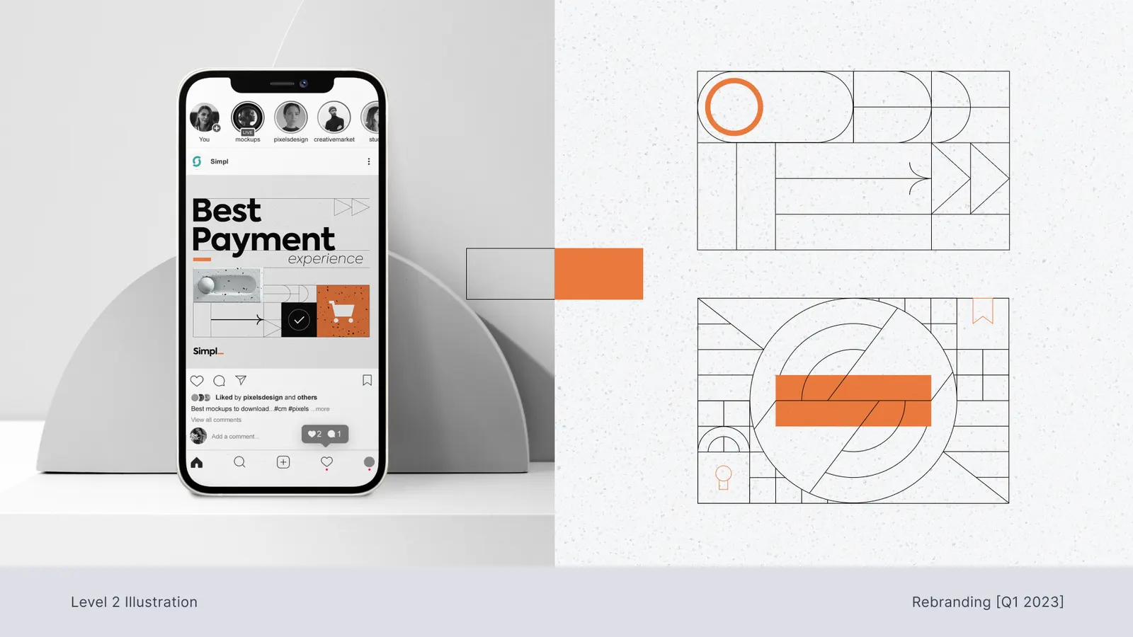
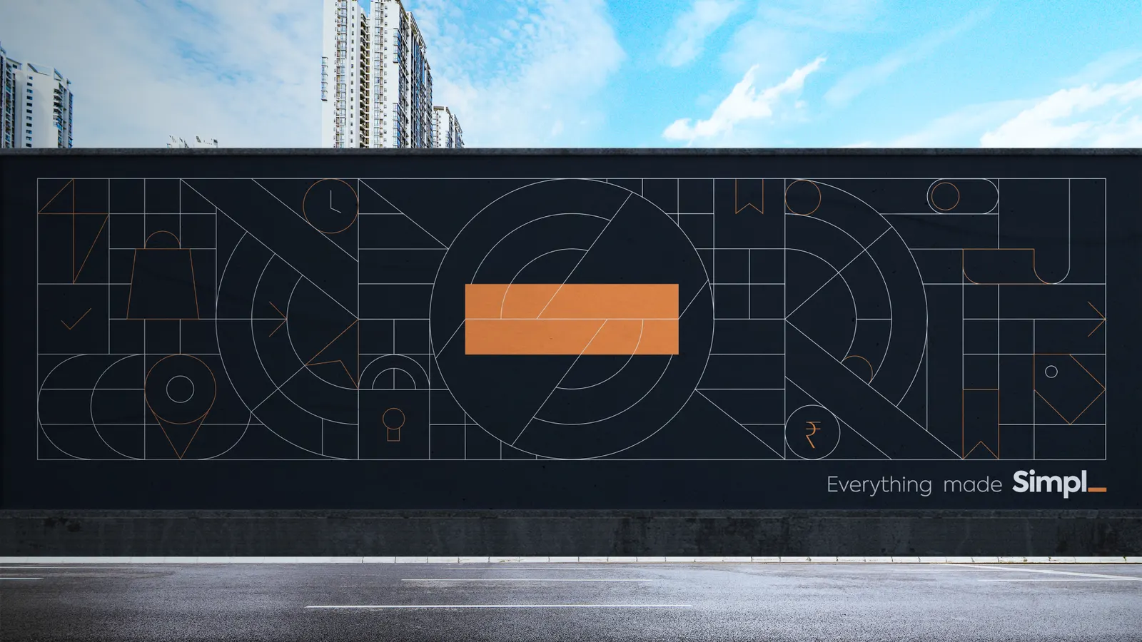
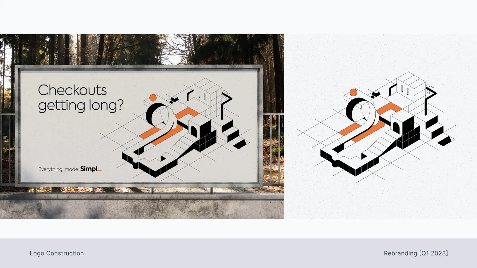
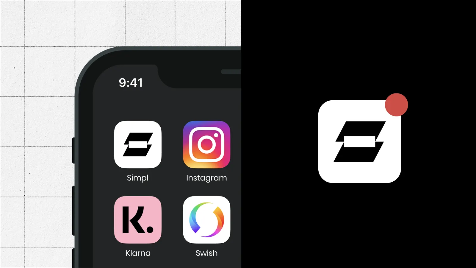
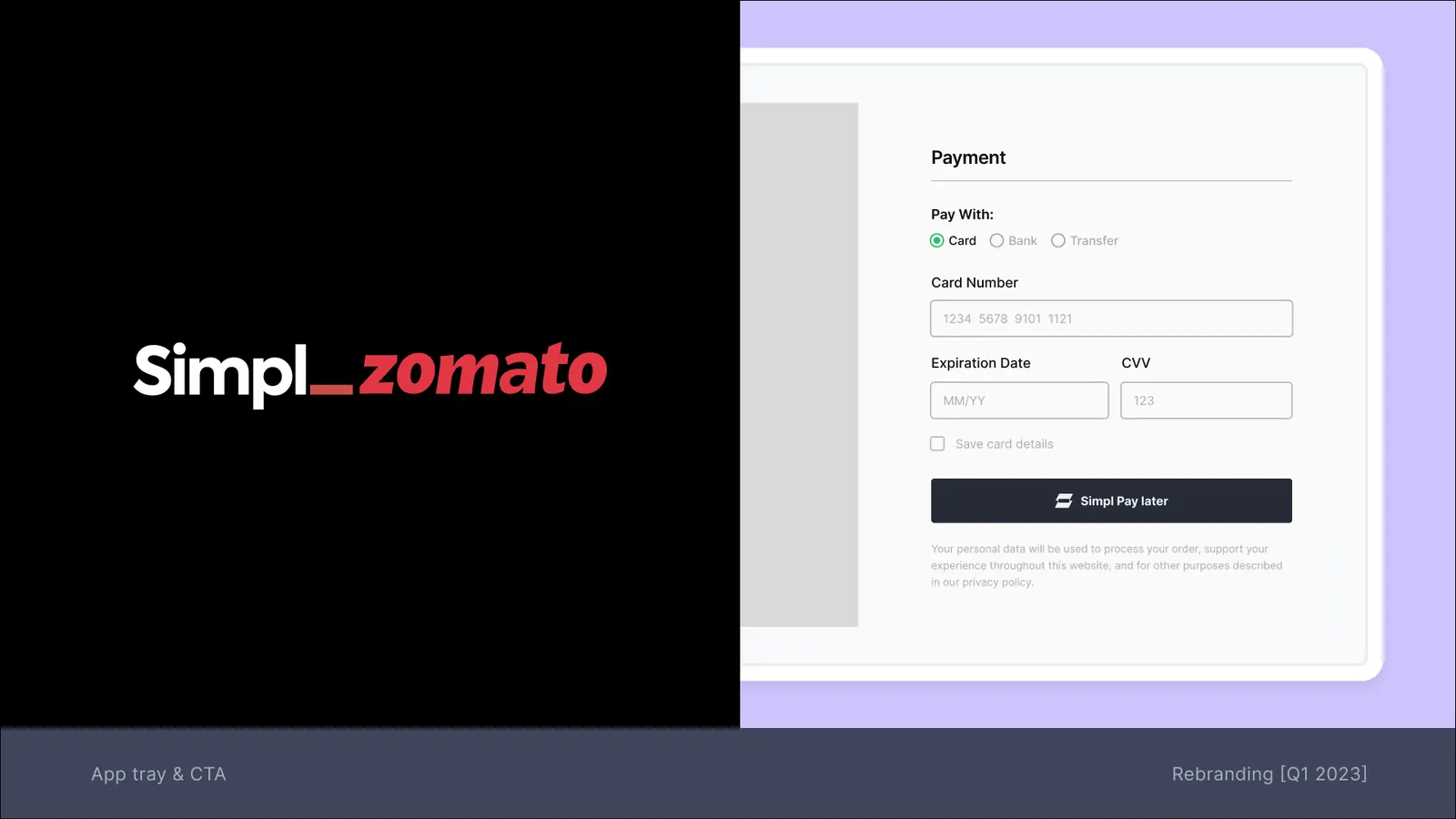
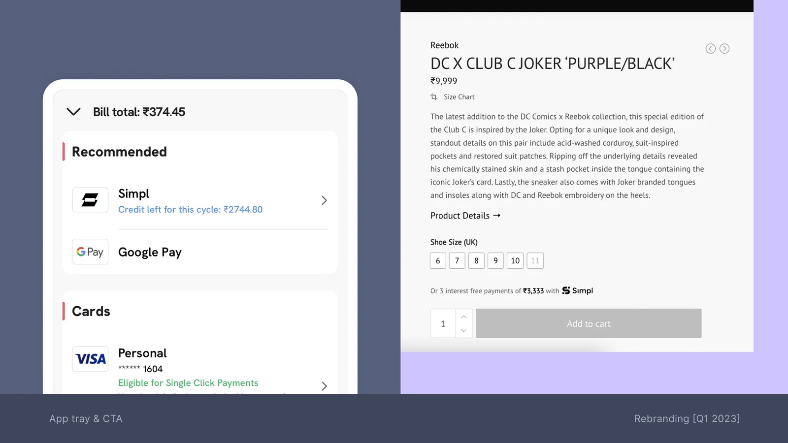
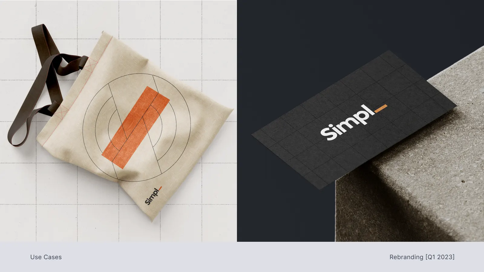
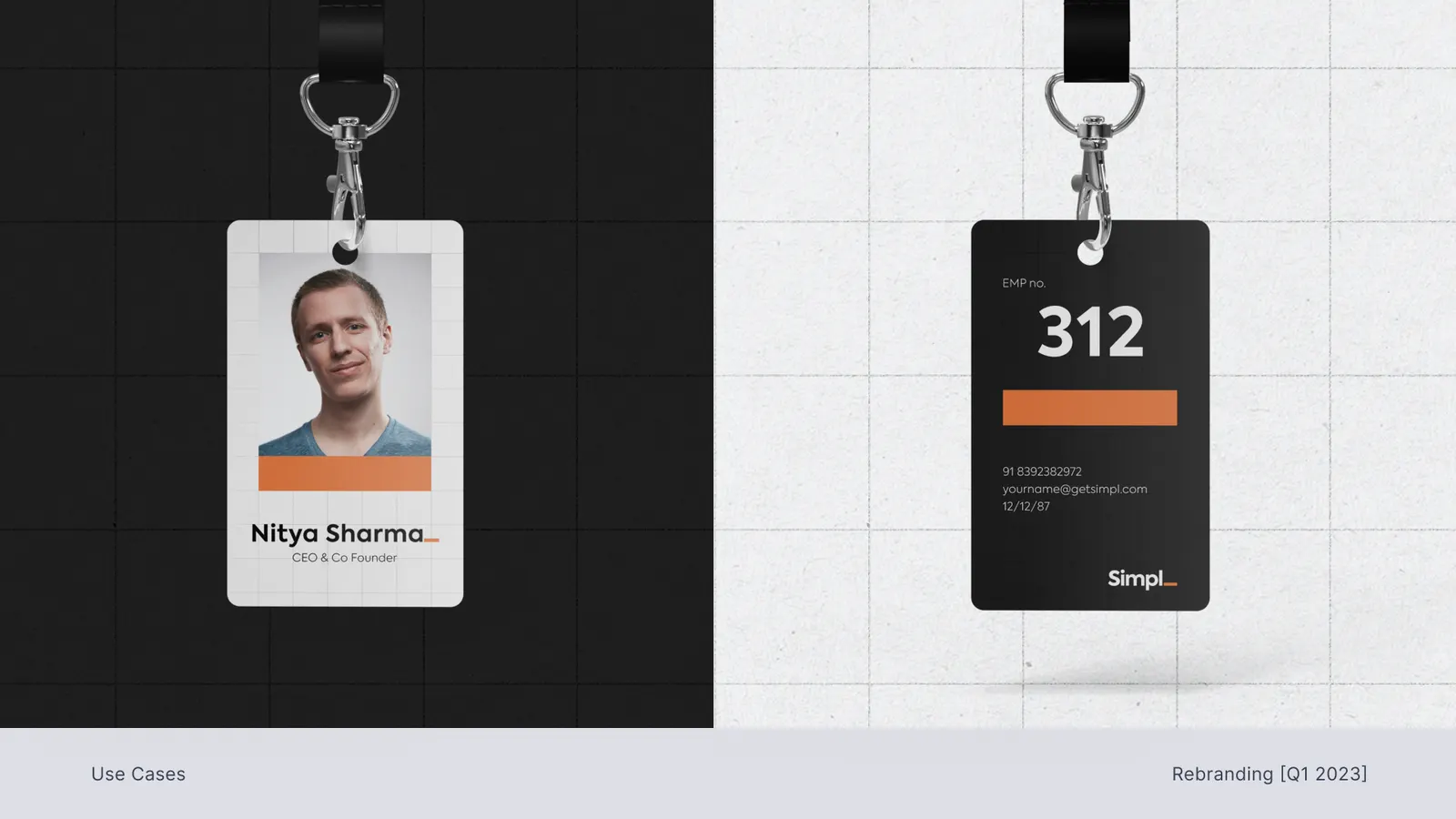
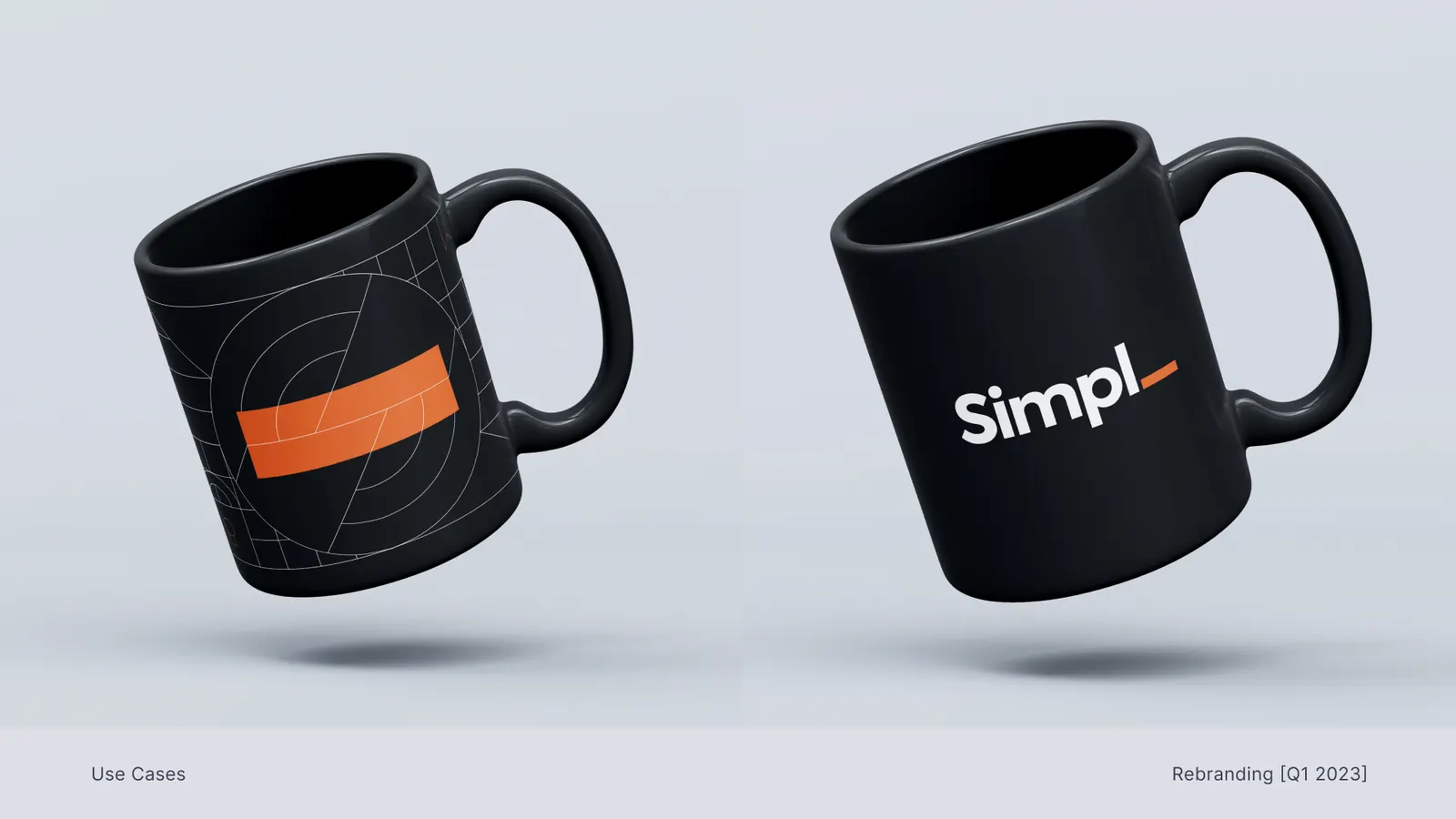
The pitch, and after
The founders liked it, but didn’t take it. With the business in flux and merchants just starting to trust Simpl, they chose evolution, not a fresh start.
The hardest conversation was telling the team. I didn’t pretend it was fine. We talked about what we were proud of, and I made sure the work got credit even though it never shipped.
Finding the middle ground
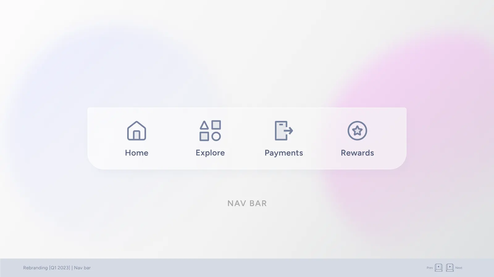
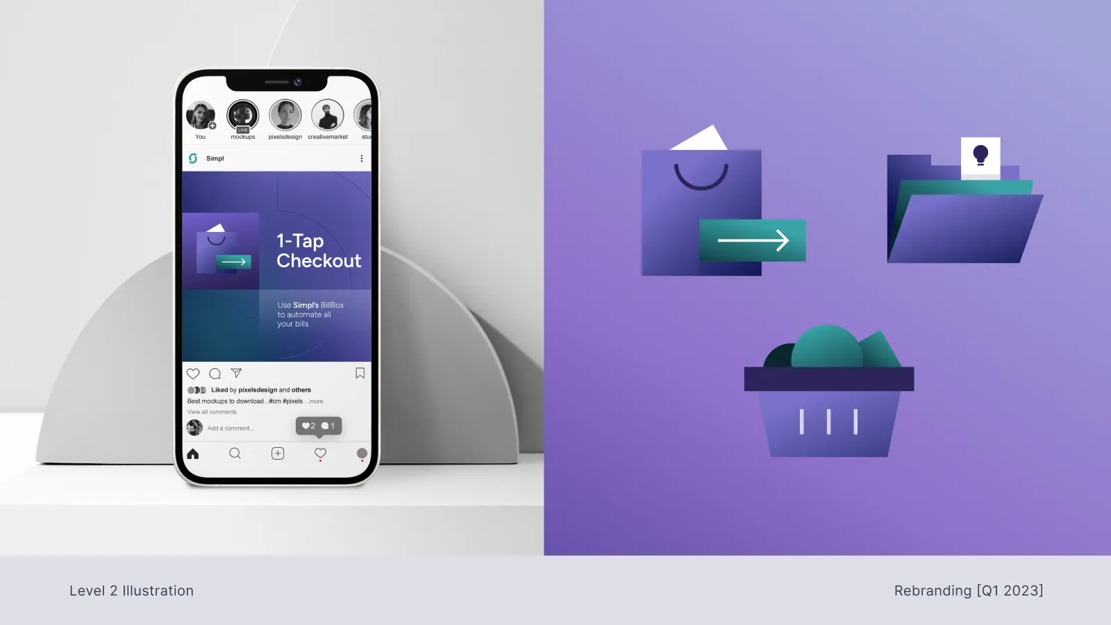
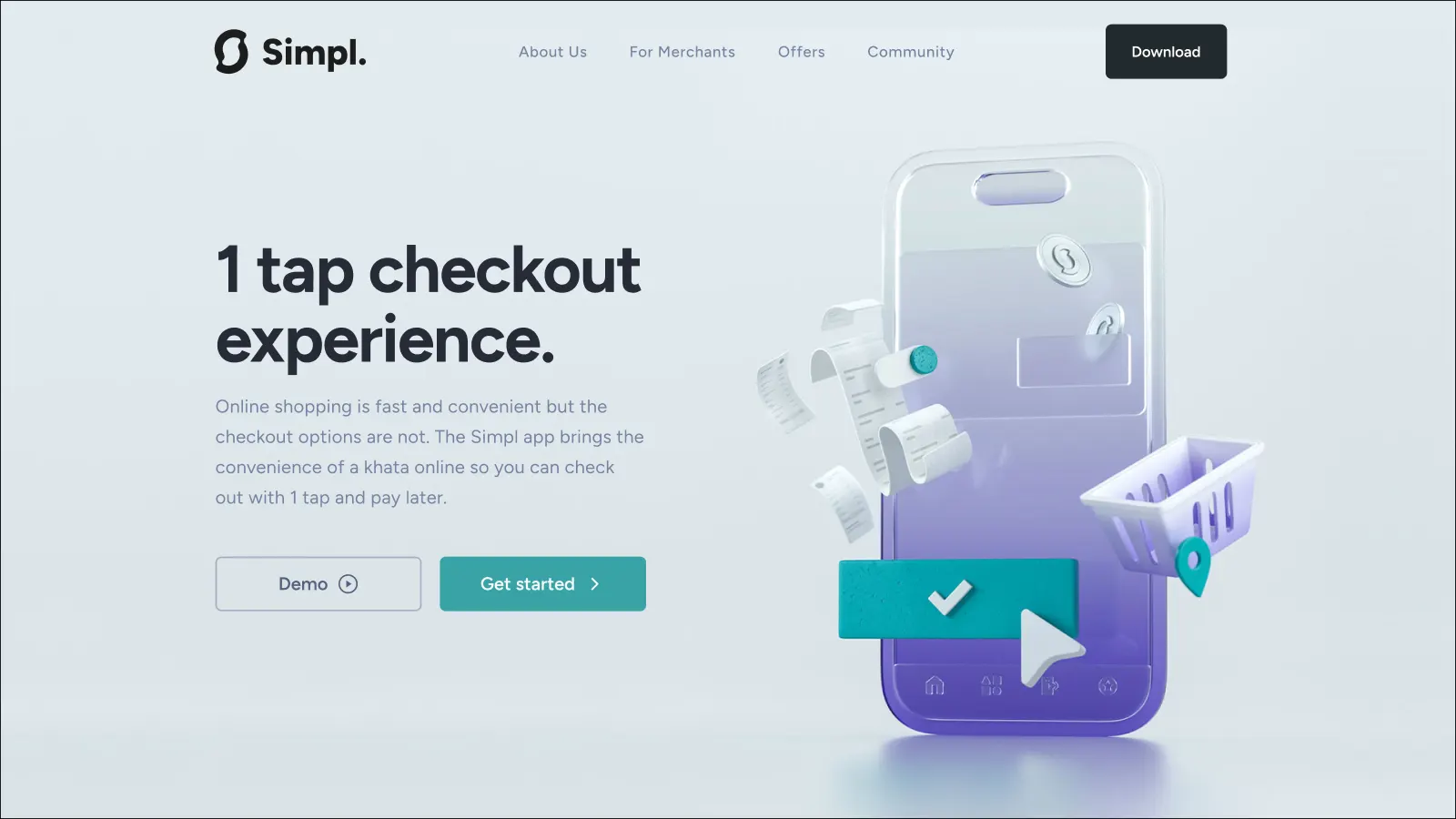
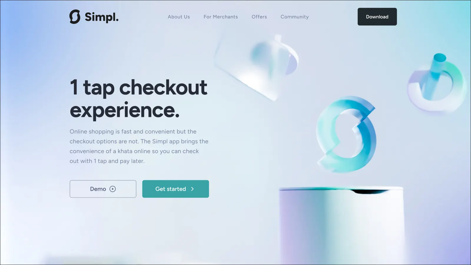
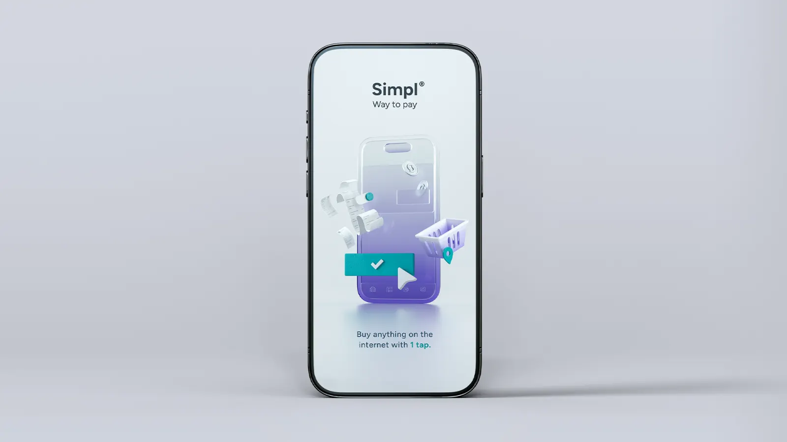
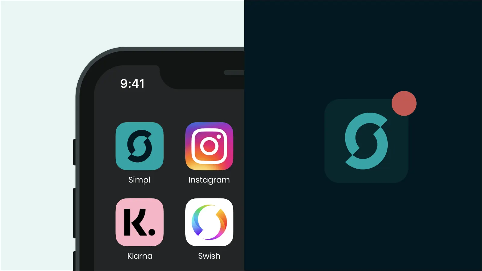
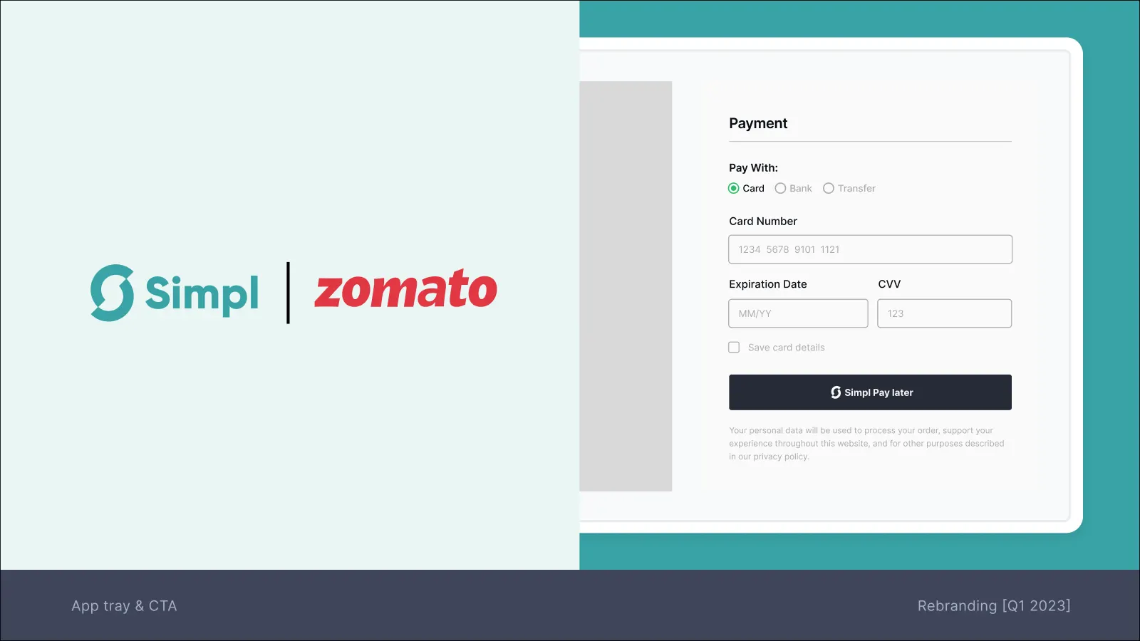
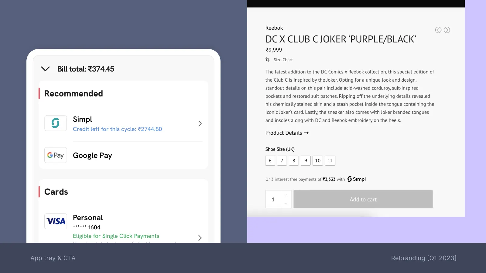
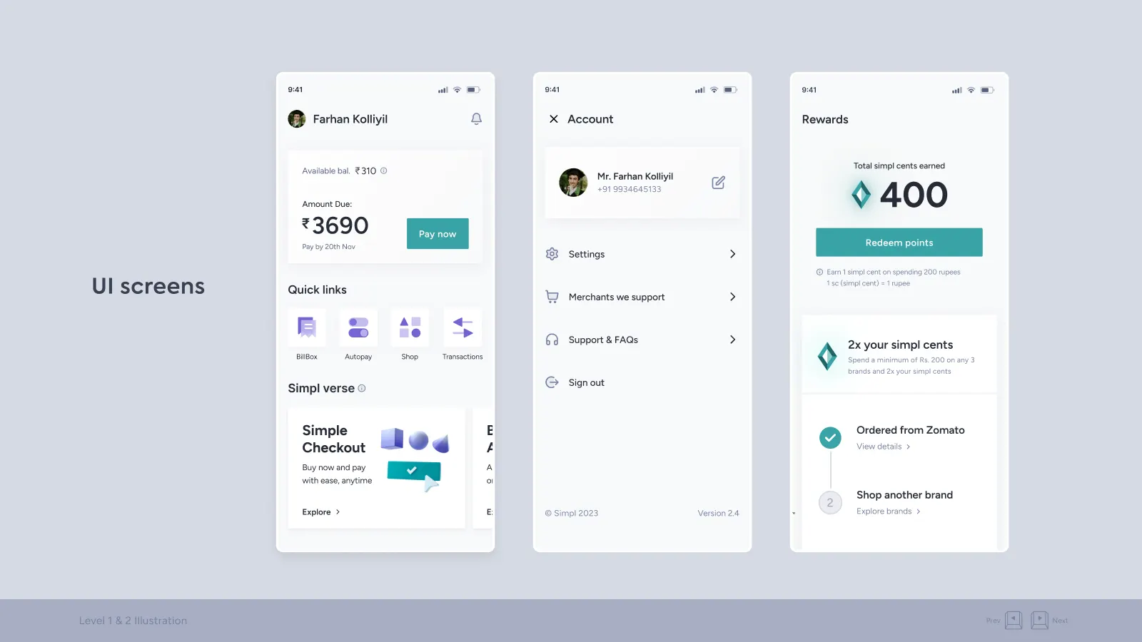
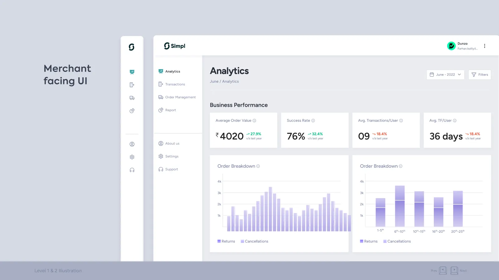
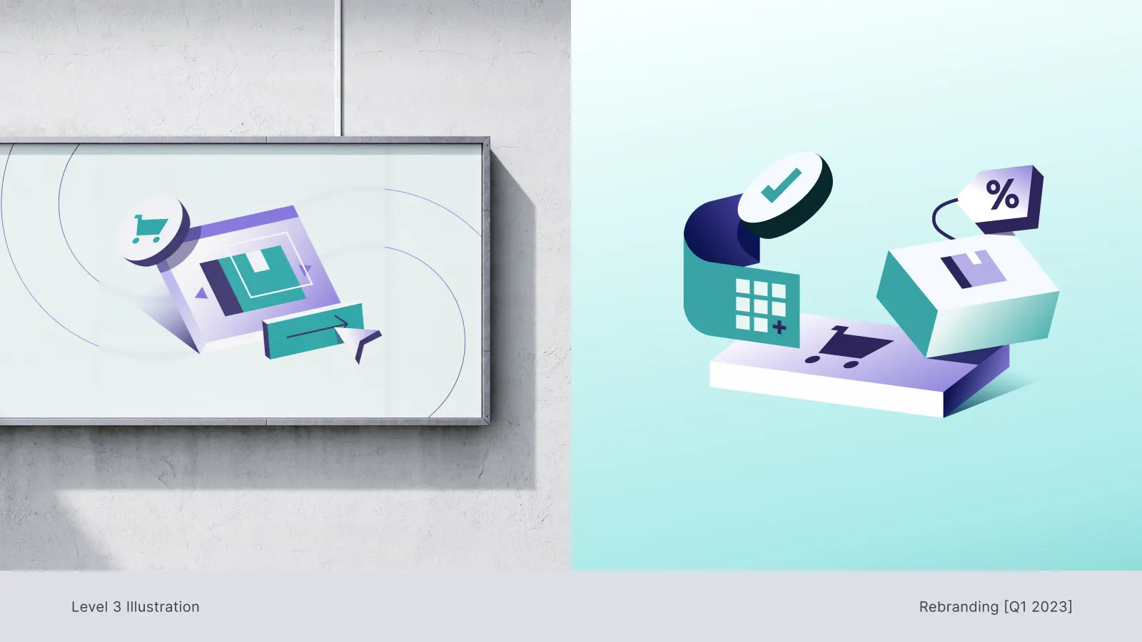
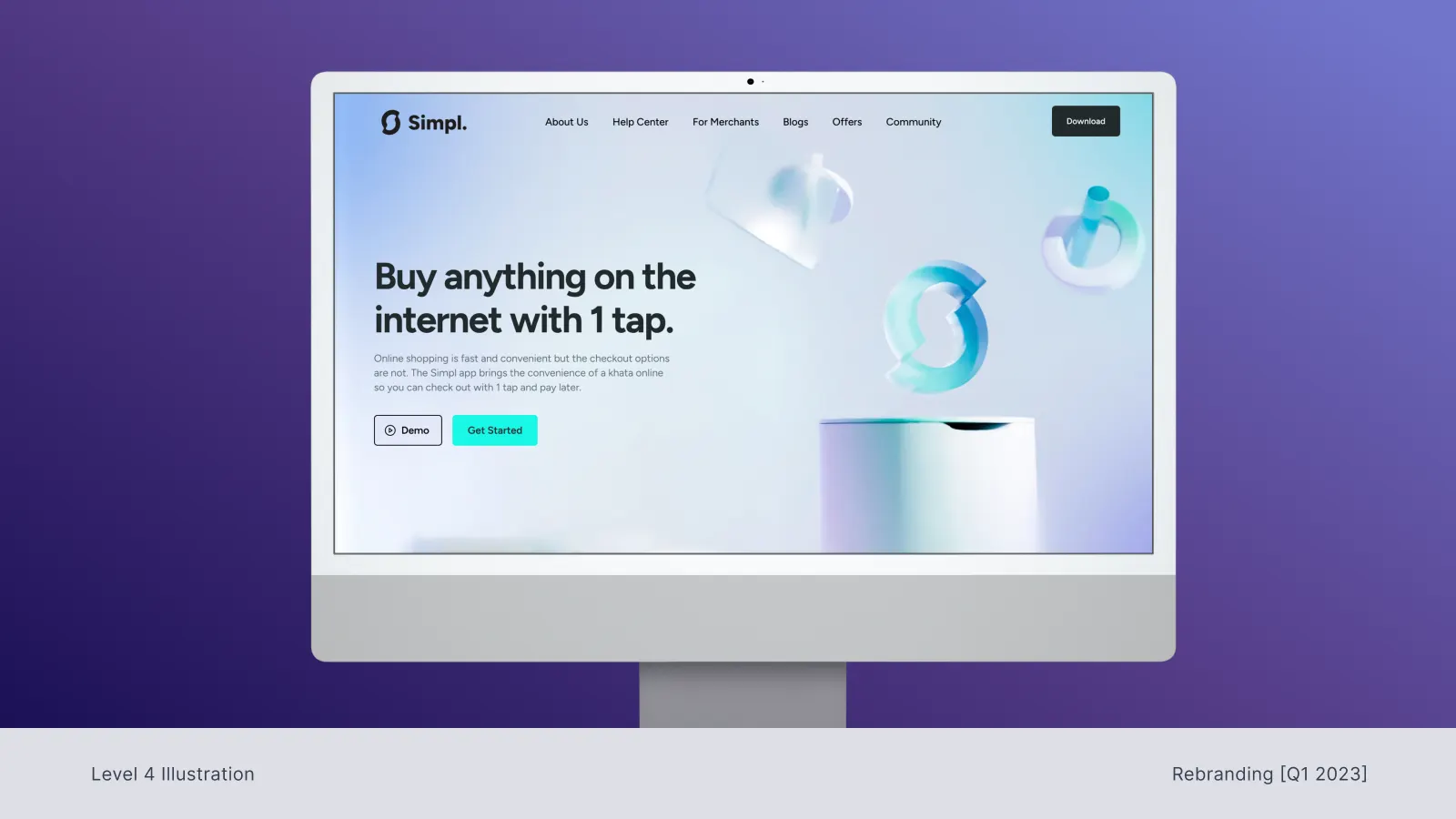
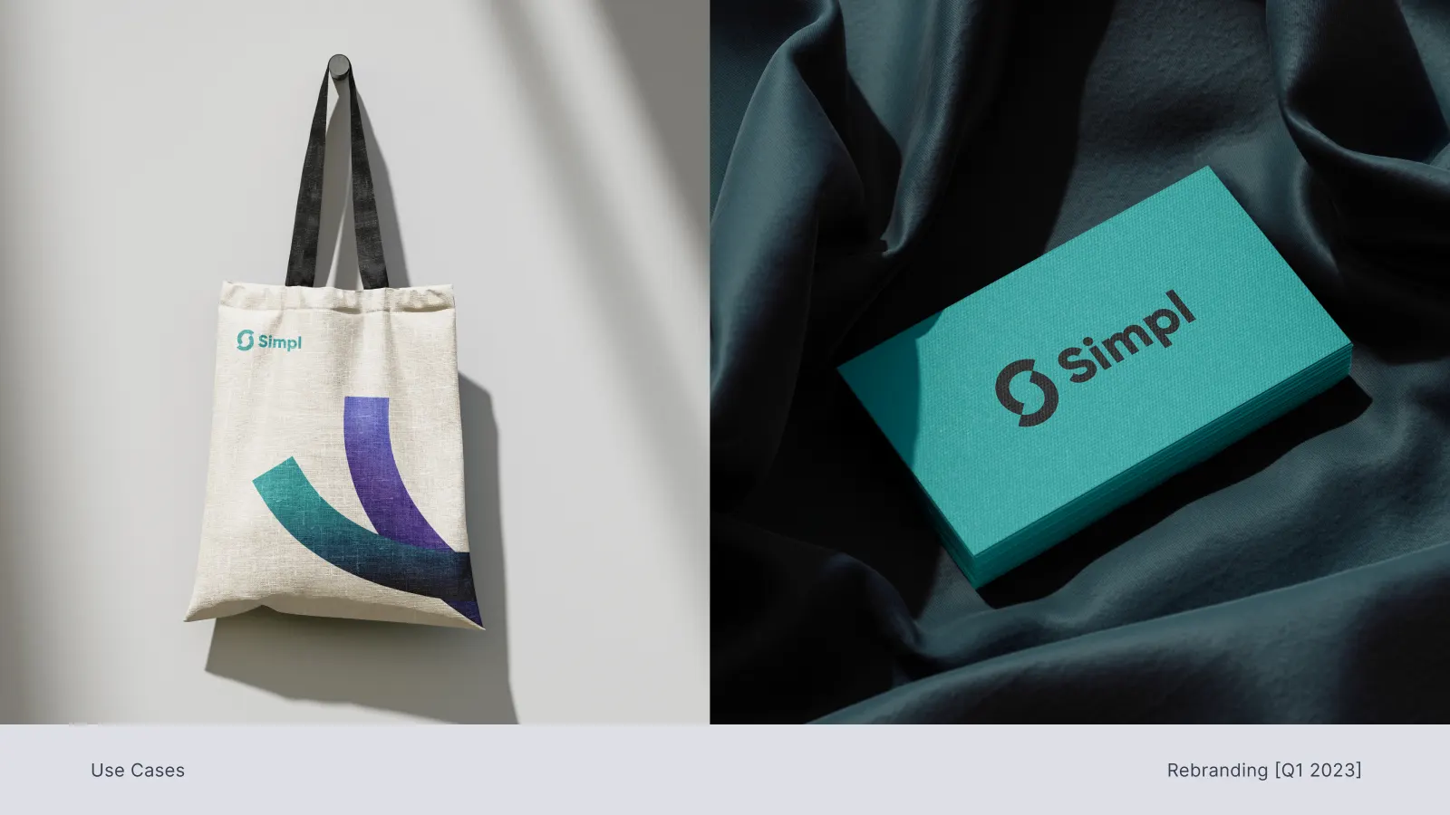
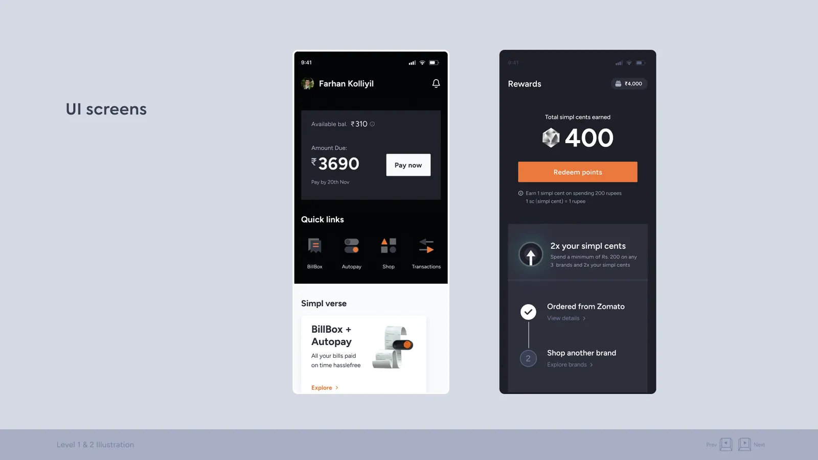
A no on the rebrand wasn’t a no on better work. We kept the logo and name, refocused on the best ideas from both routes, standardised illustration, icons, colour and motion into one kit, and added a touch of neo 3D. Quieter than Simpl 2.0, but everything finally looked like one company.
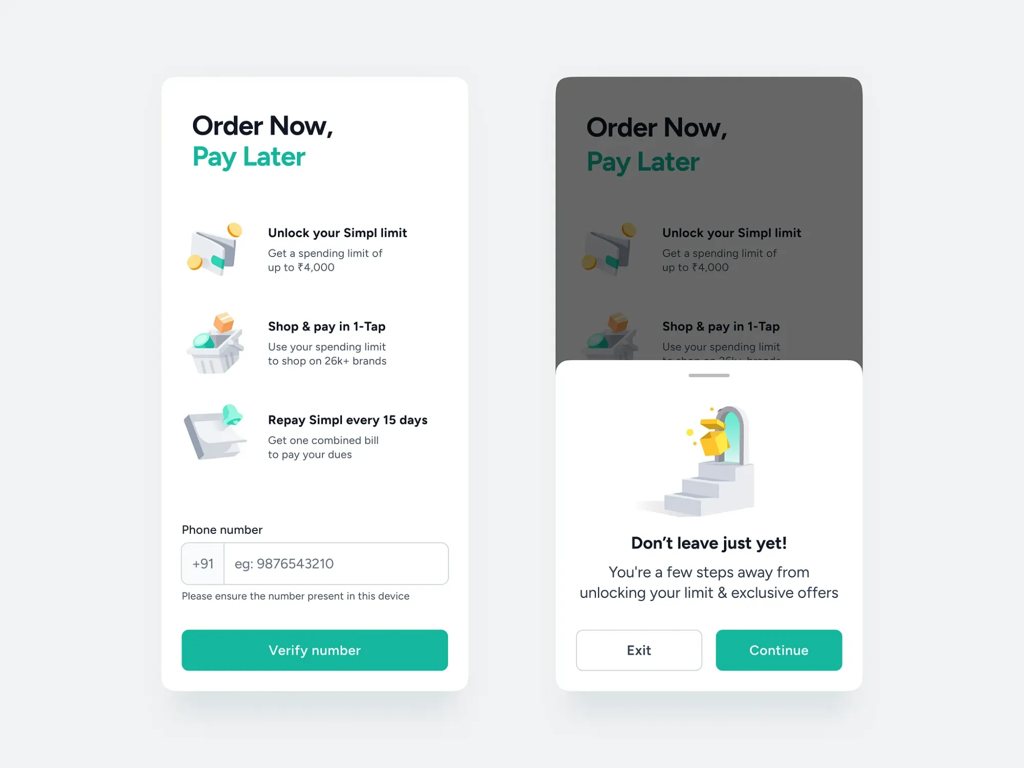
Where we landed: the same logo, a shared kit and light neo 3D across checkout, 1-Tap and Pay Later.
What I’d do differently
- One big reveal
- Asked the founders to take the whole leap at once
- Sell the risk in smaller pieces
- Test the new story with merchants first
- Bring real reactions into the room
- Let the founders take the leap one step at a time
Sometimes big ideas fail because they arrive all at once. I’d still make the same work again.